PURPLE

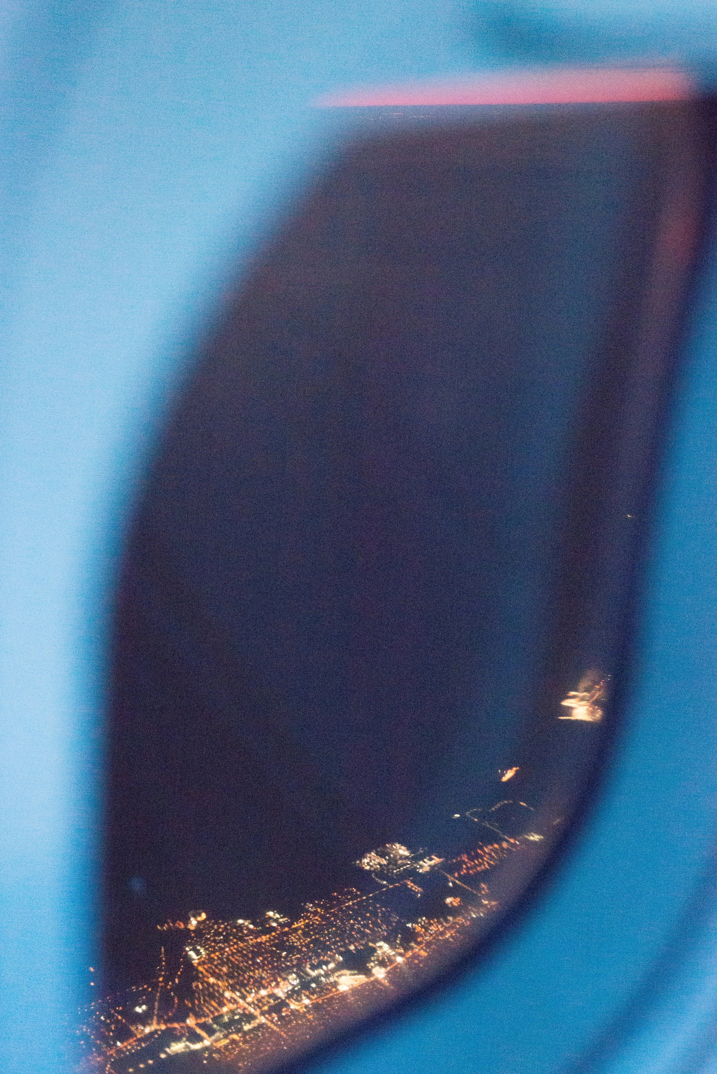
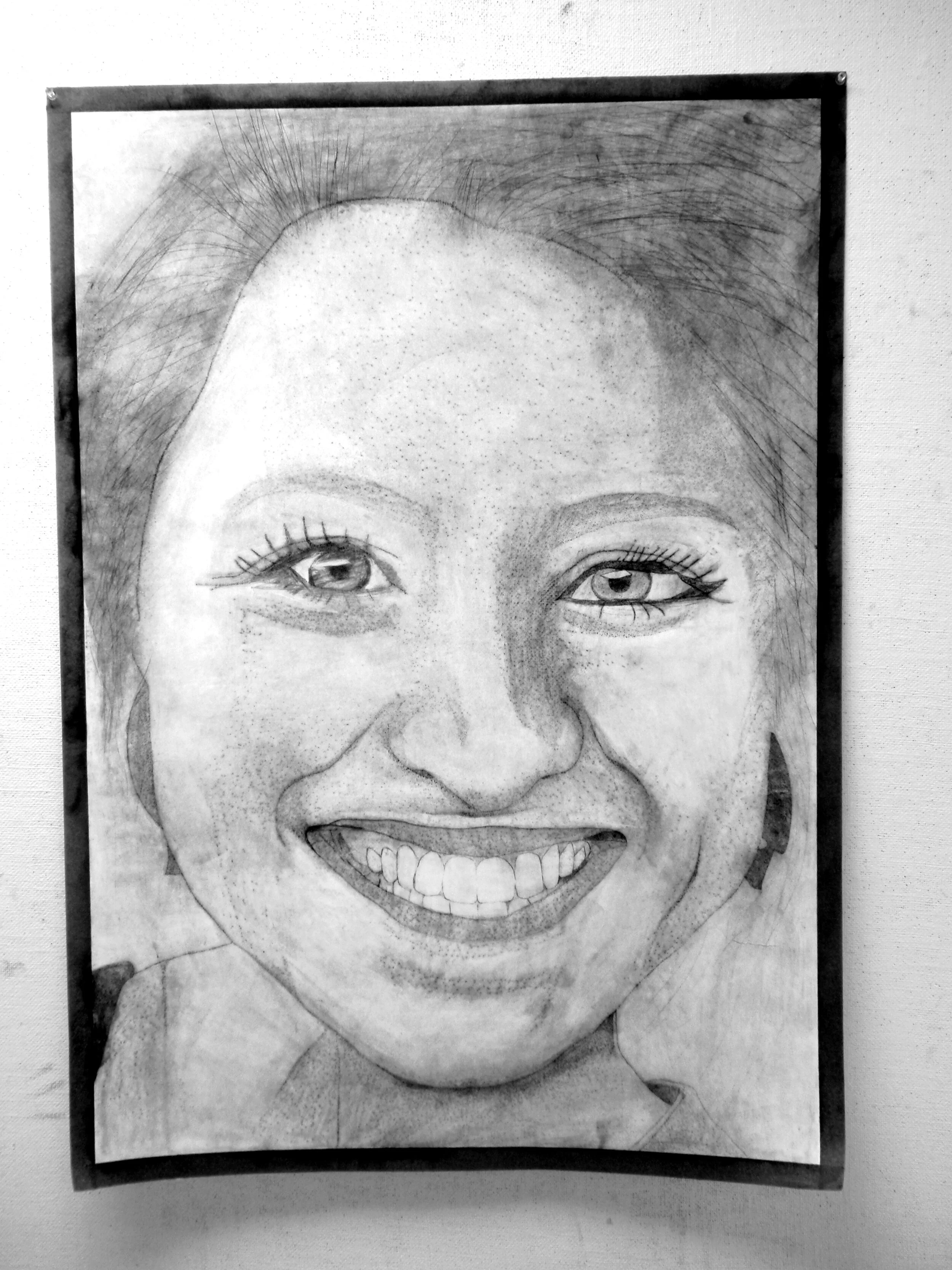
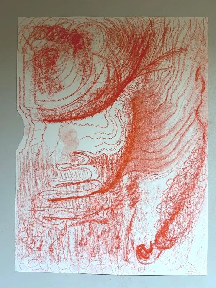
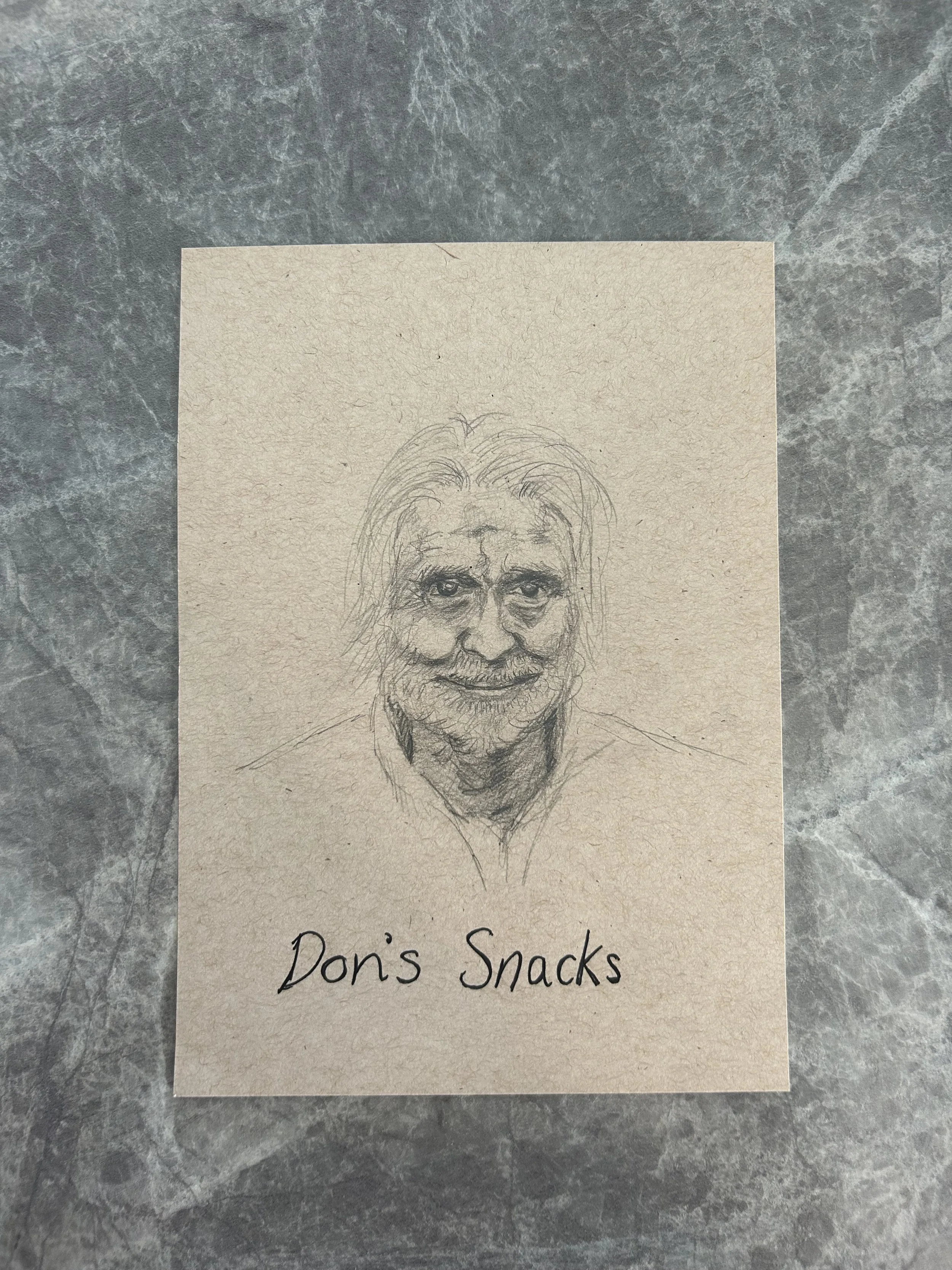
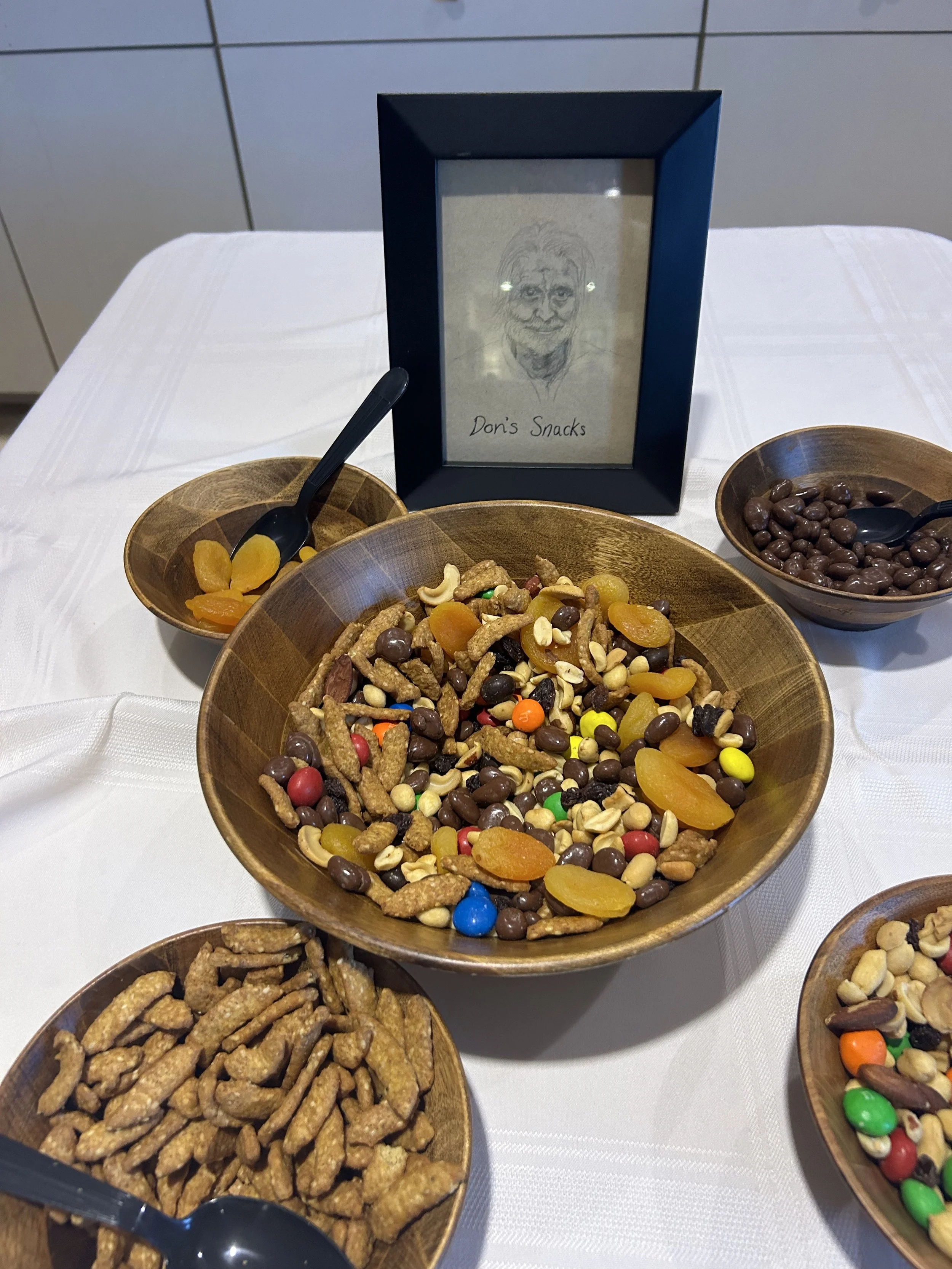
We have arrived at the beginning of the end. The color purple comes from mixing red (flesh/mankind) with blue (word of God) leaving you with the purpleness of royalty, priesthood, and inheritance. Oddly enough, at the start of my purple season I received a letter in the mail about my inheritance from my dad. If you have been following along with my rainbow year, you might remember at the start of this rainbow my dad passed away. 9 months ago now. Not that grief really has an end, but this rainbow seems to be a little capsule of that process. Death through to inheritance. Here’s a sketch I did of my dad that we put by his favorite snacks at the celebration of life.

We often talk about receiving all of what the Lord paid for when Jesus died on the cross, rose again, and restored us into a right relationship with The Father. That state of “right living” being the inheritance, the end goal. That “right living” can also look like stepping into your royalty and living your days as one giving endless supply of love, forgiveness, grace, and all the goodness to the people you find yourself next to. Priesthood and royalty make me think of serving. The best leaders know how to serve those they are leading.

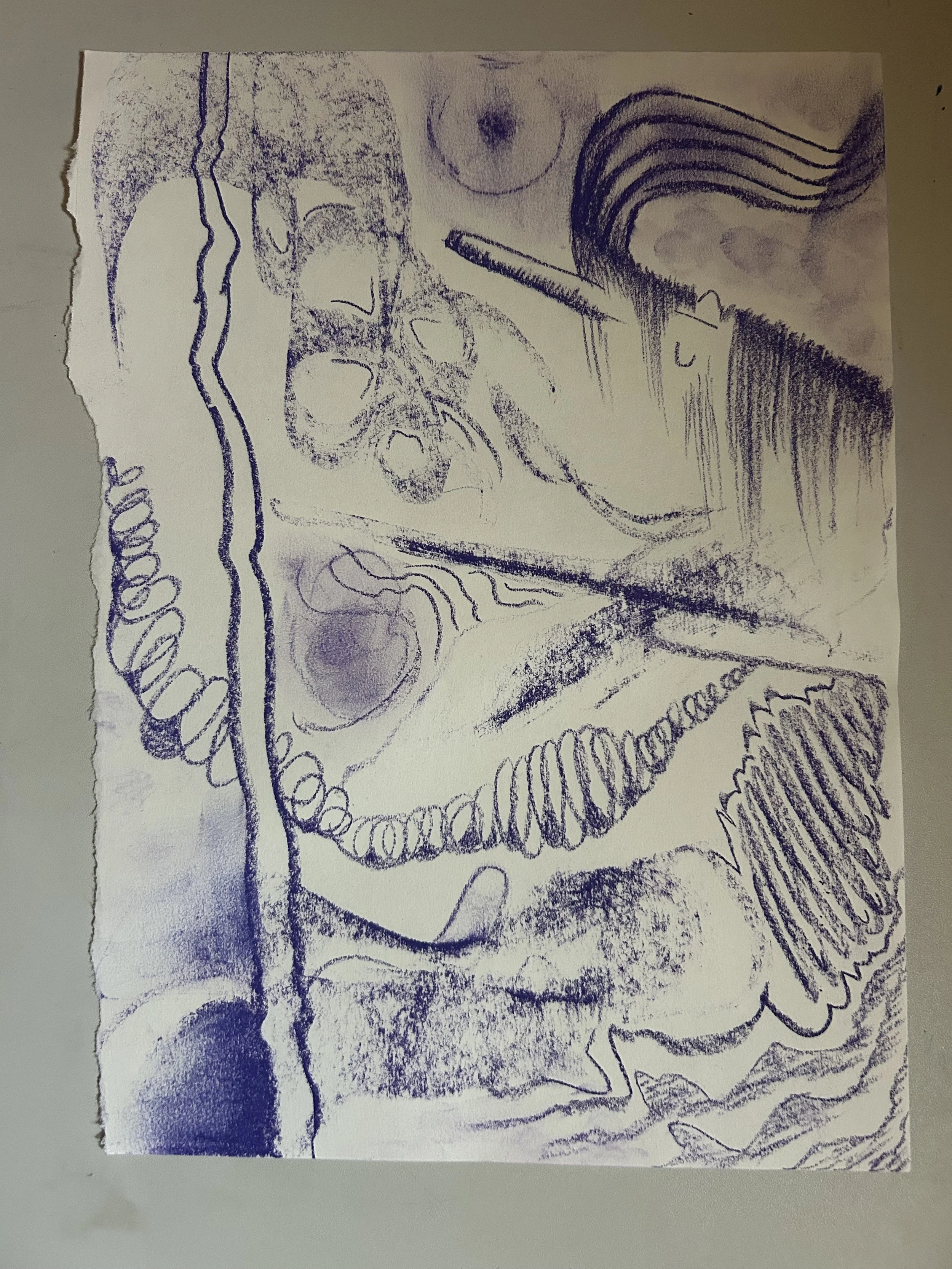
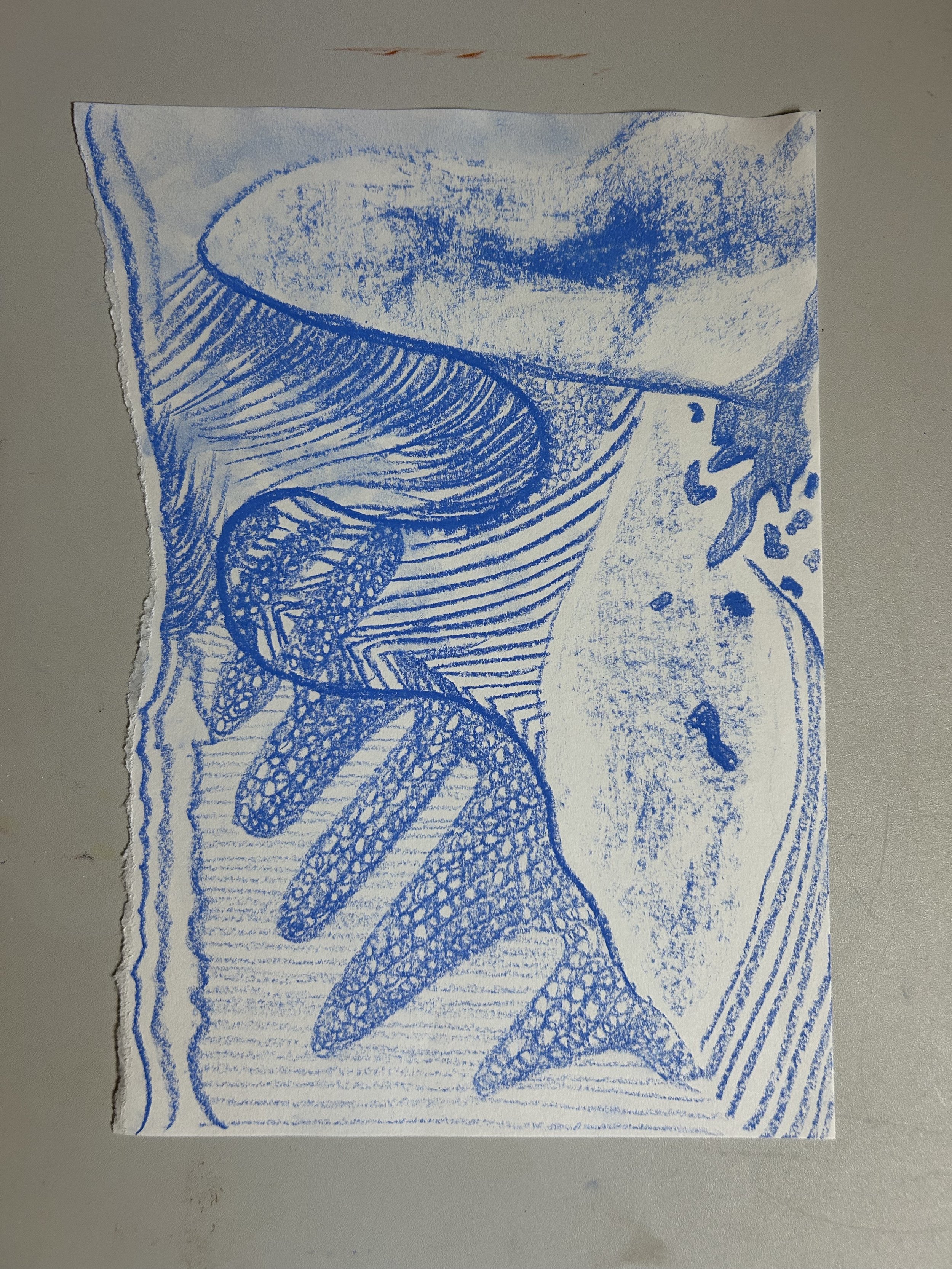
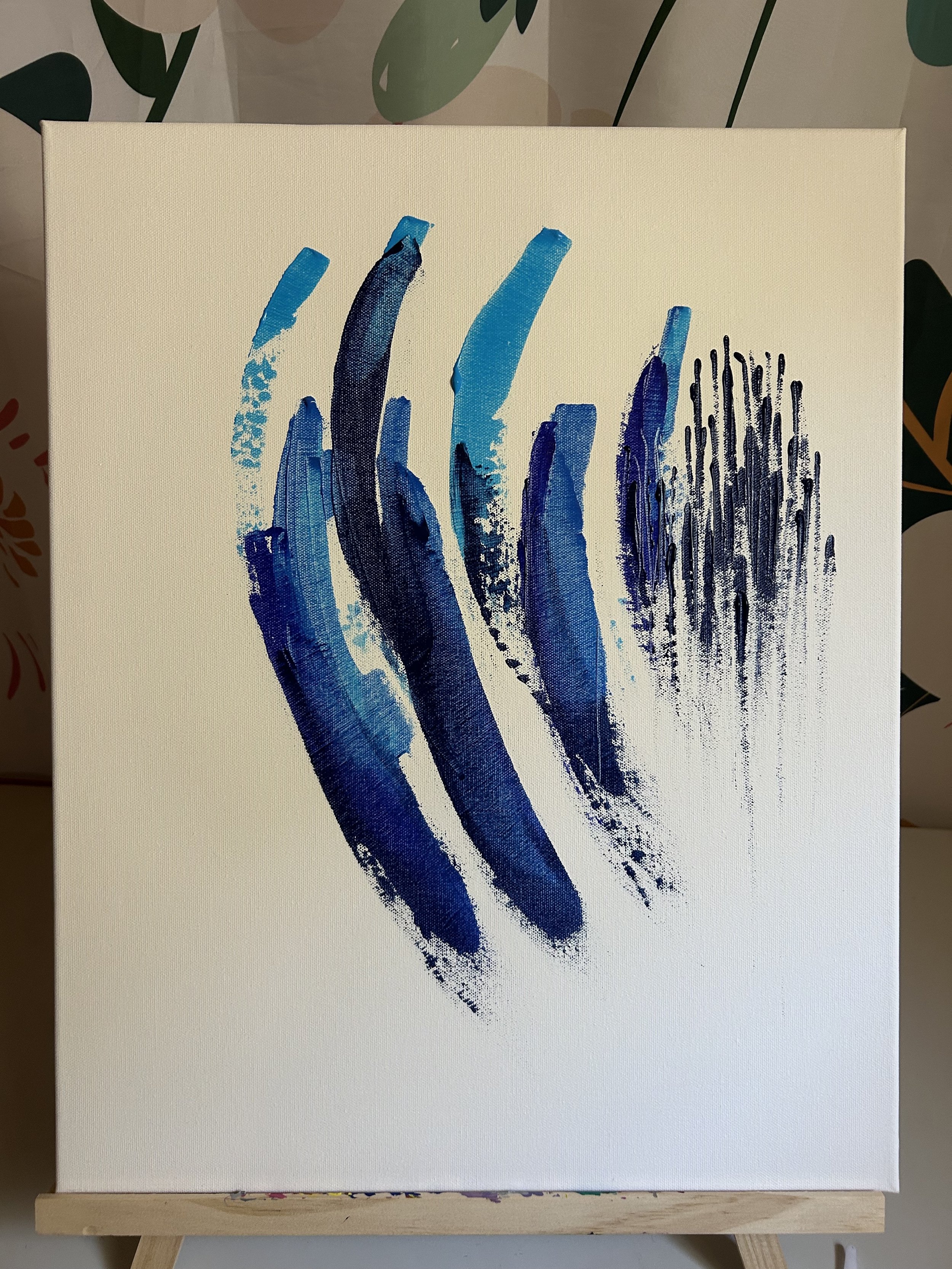
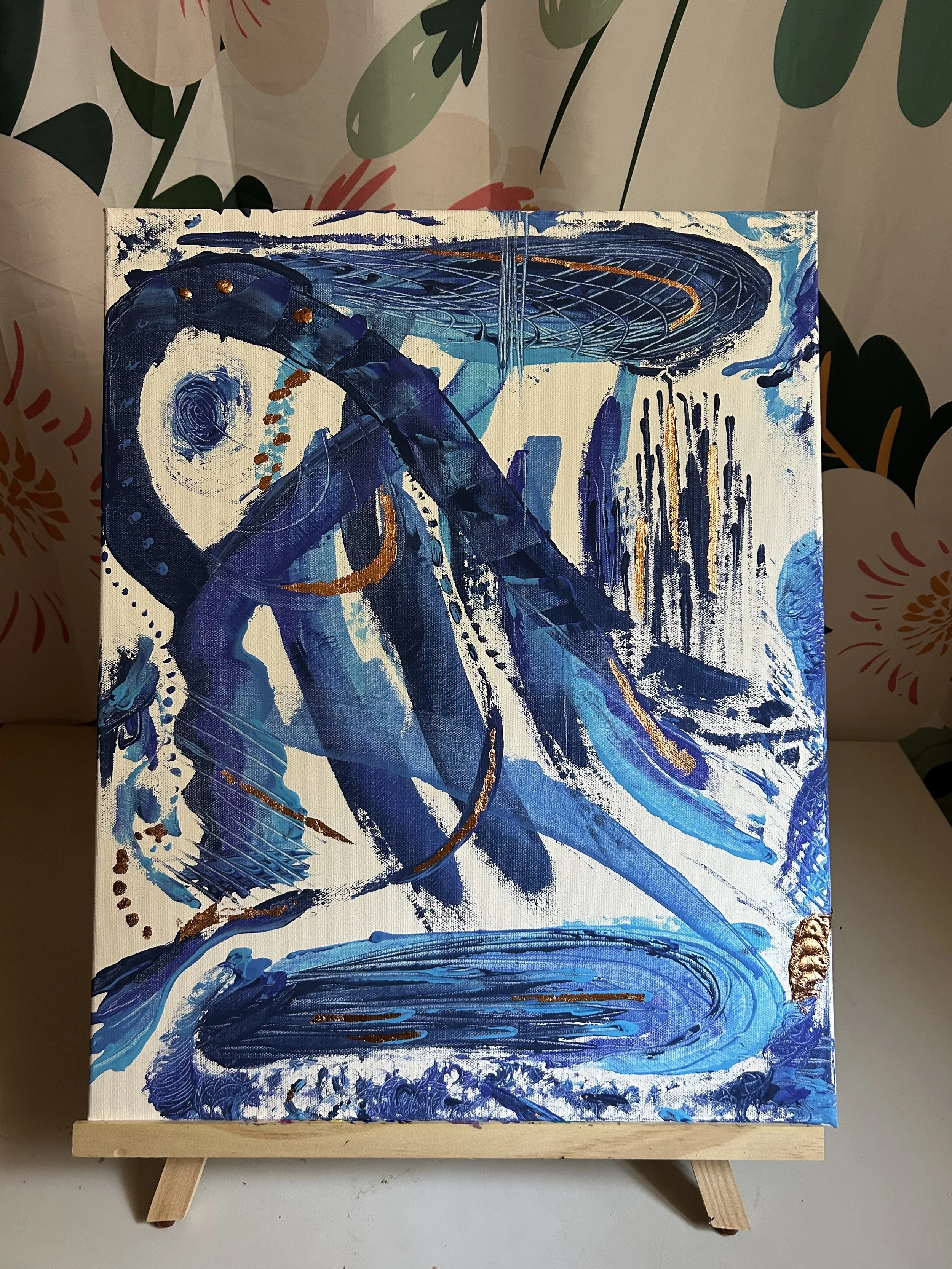
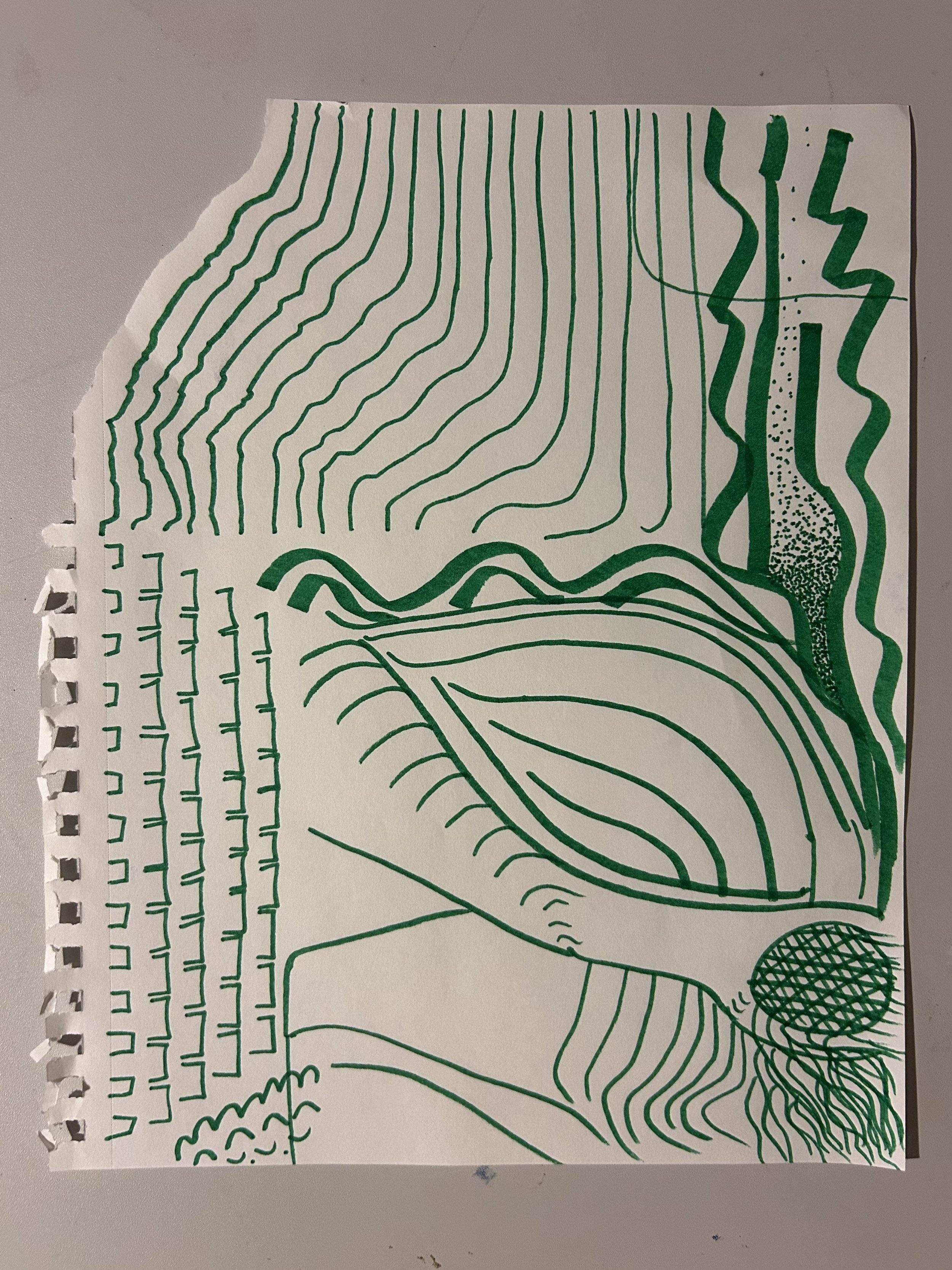
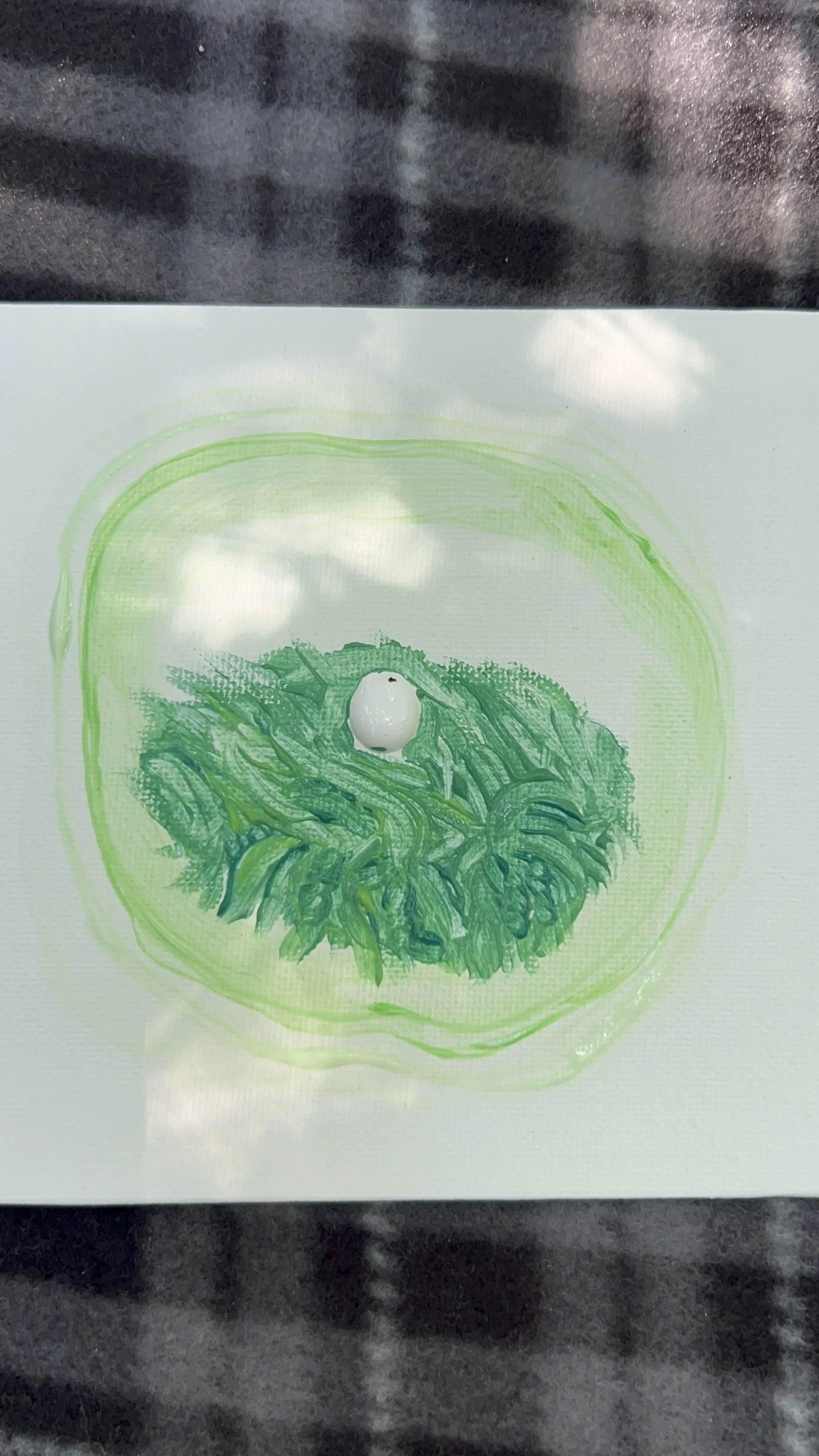
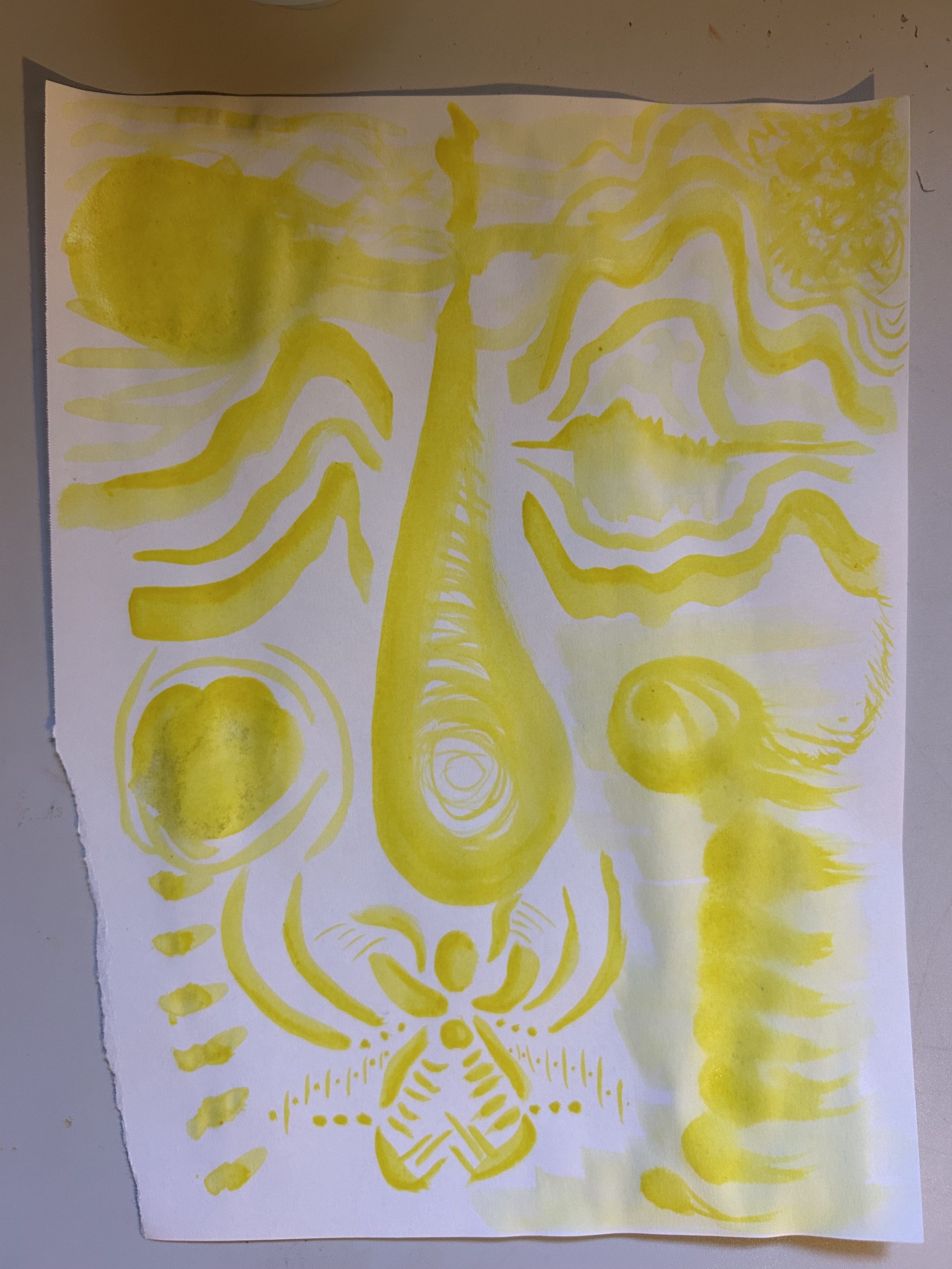
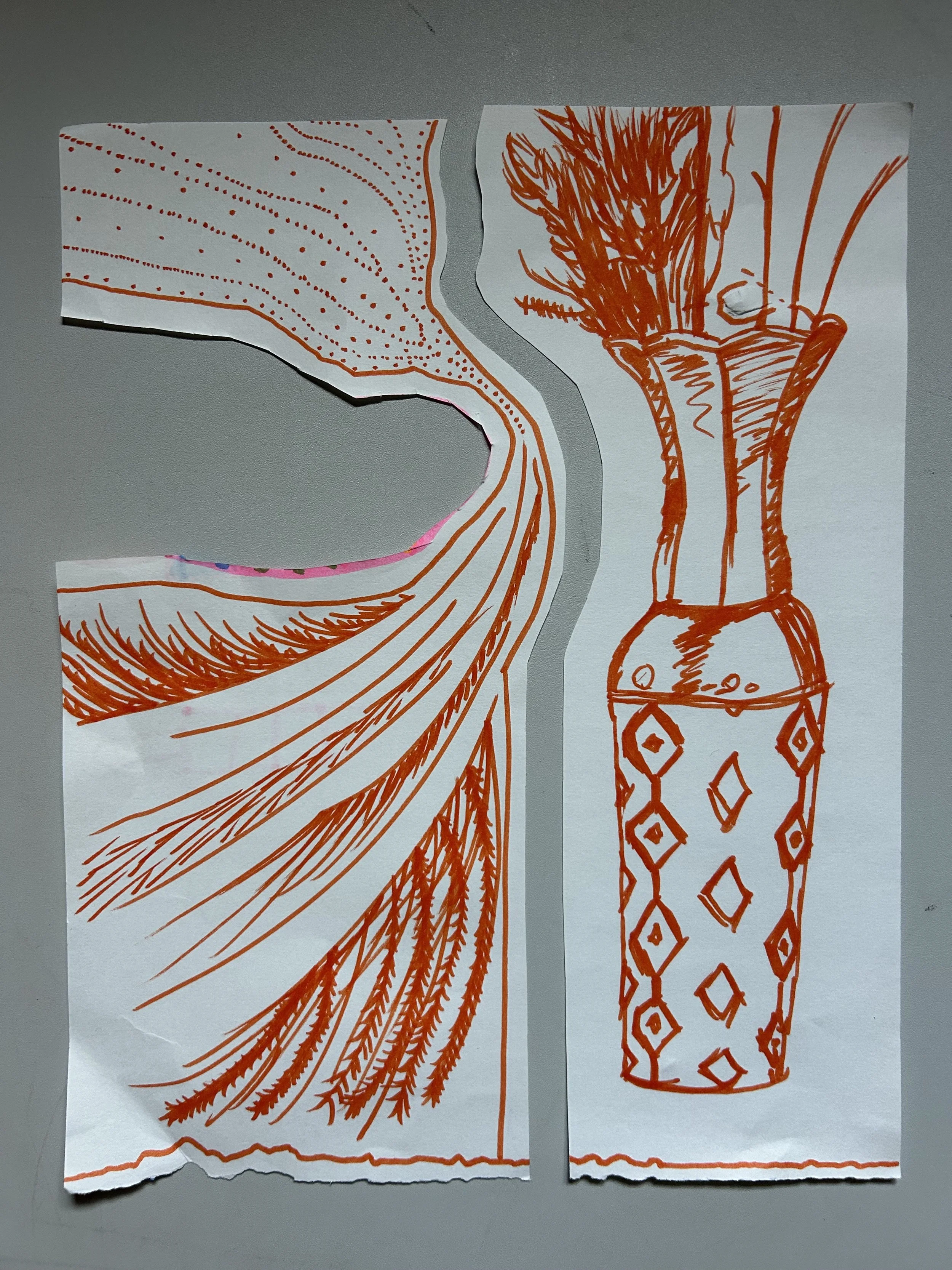
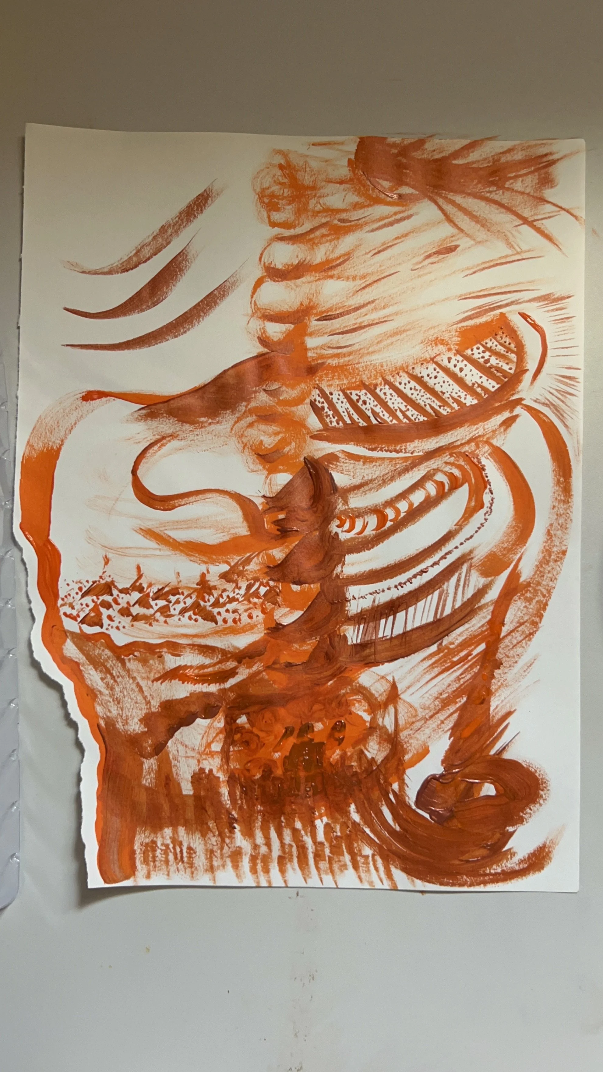
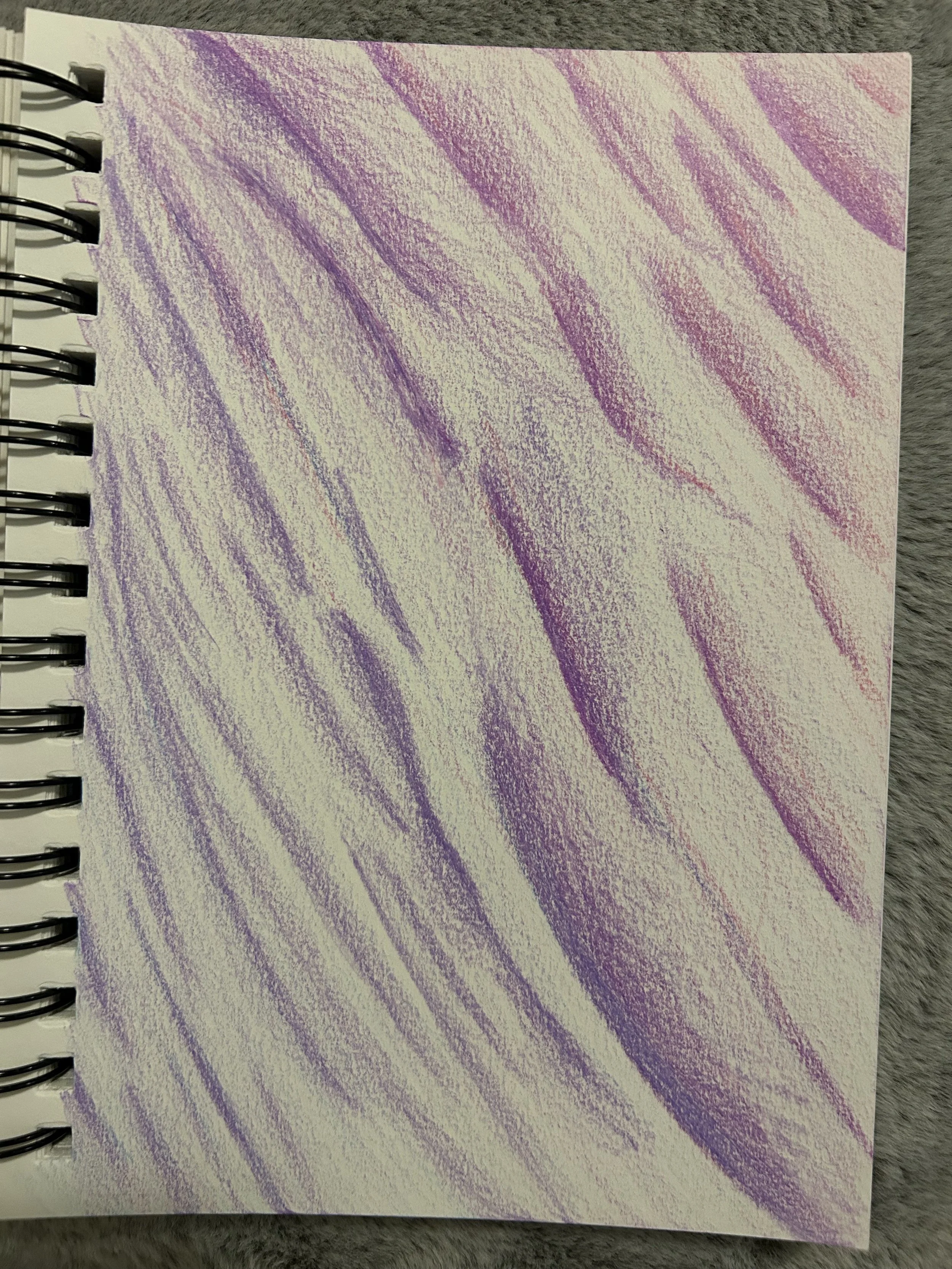
I did the last pastel of my rainbow. I want to put them all together. Line ‘em all up. This purple one reminds me of landscapes. When I look at it, I can’t help but imagine a little character walking through the different landscapes. Almost like a video game. GRIS anyone? I also see the staff-like form on the left side of the paper. That goes along with royalty and priesthood pretty well I think. According to Google AI, the staff of kings “symbolize a monarch's power to rule, with ancient roots possibly stemming from a shepherd's crook”. Shepherds’ staff to a king’s scepter, that sounds like the upside down kingdom of God to me. A shepherd’s staff symbolizing a gentle guiding nudge to the sheep. That’s the type of ruling power I want in my life.

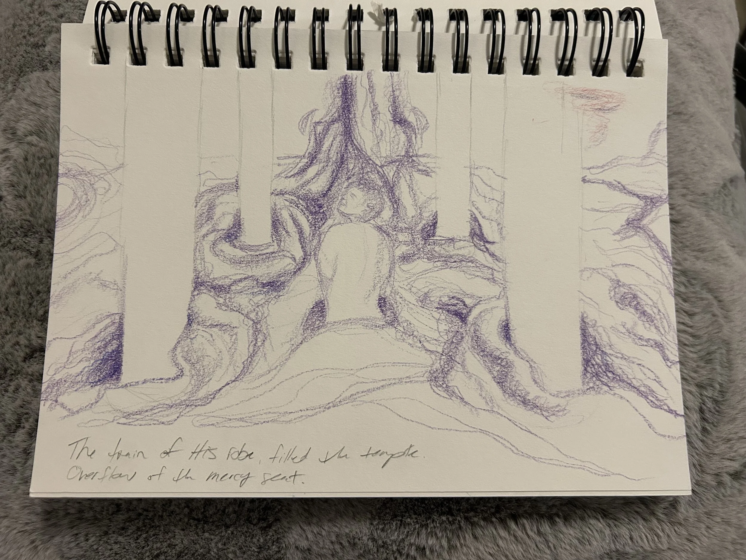
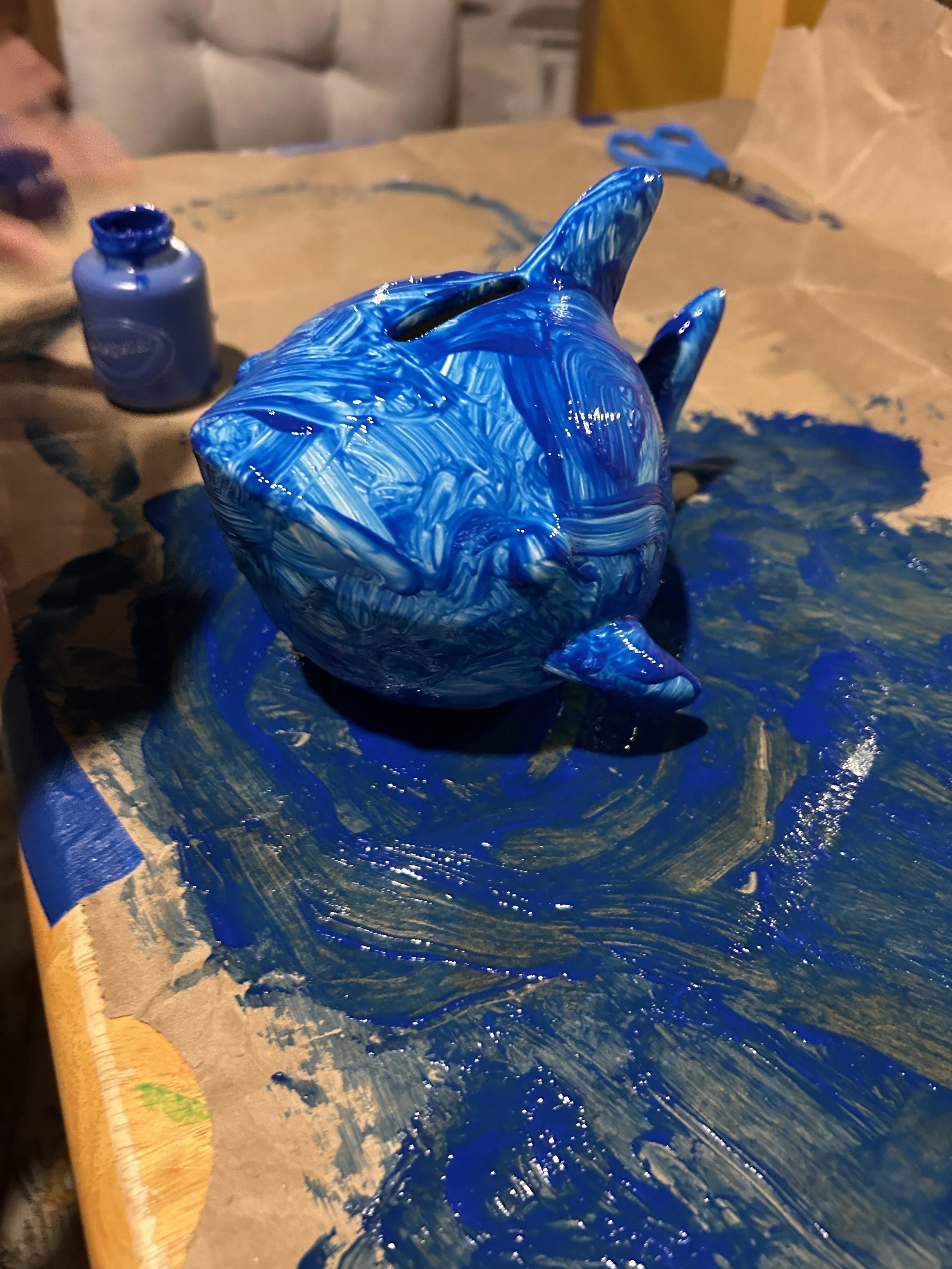
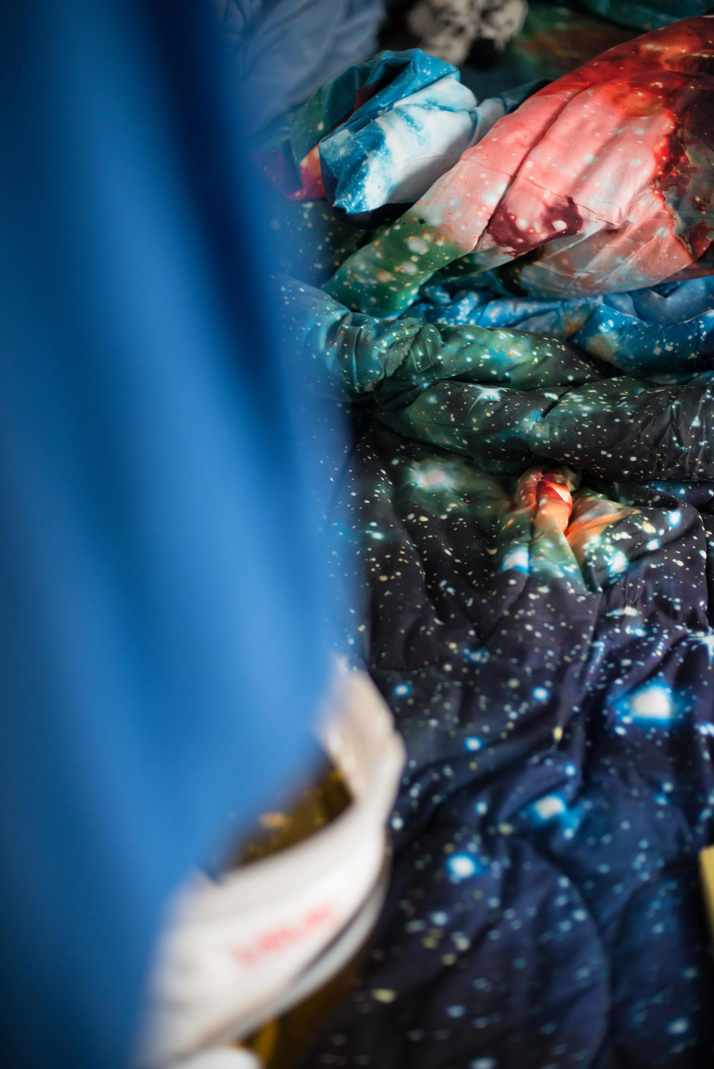
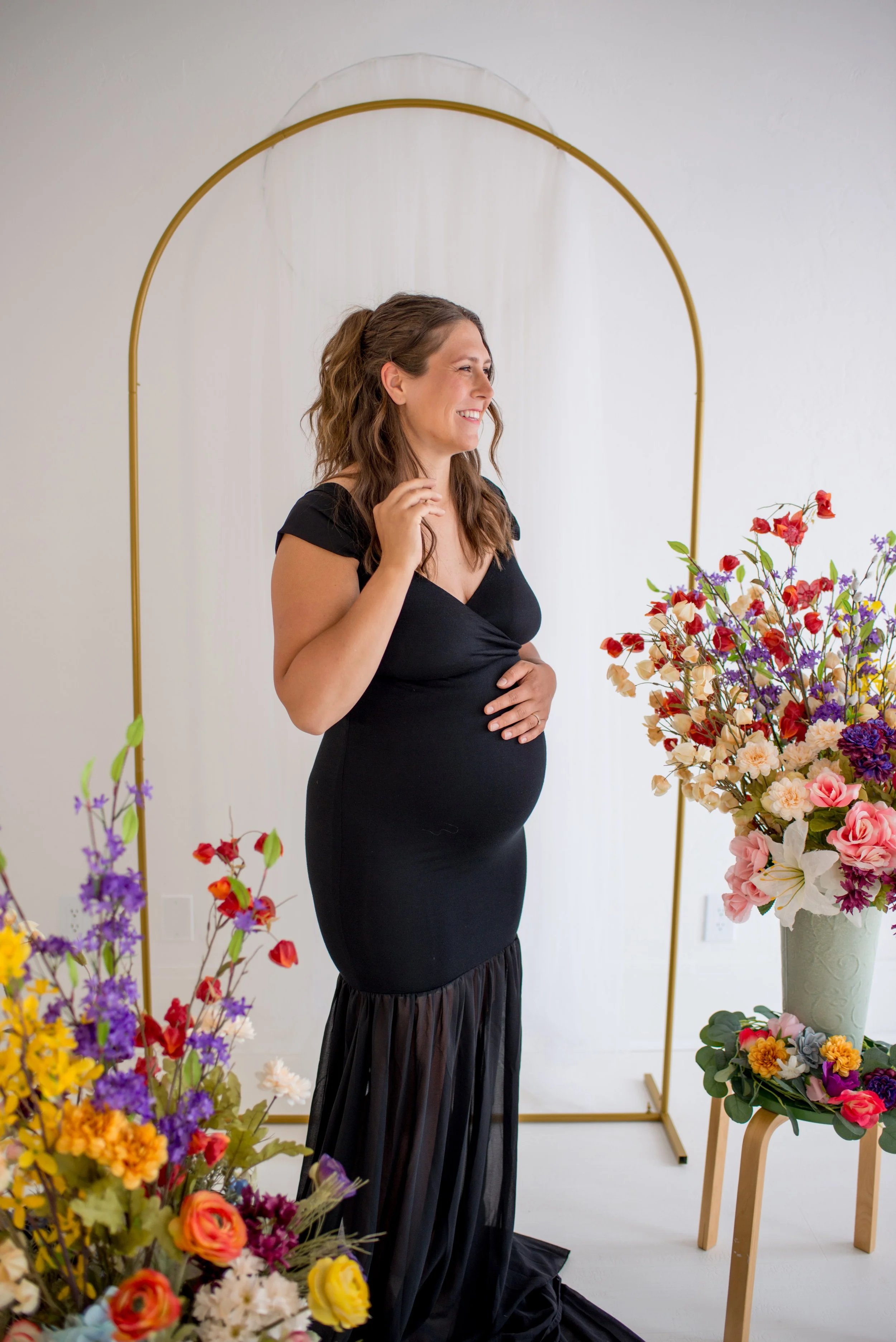
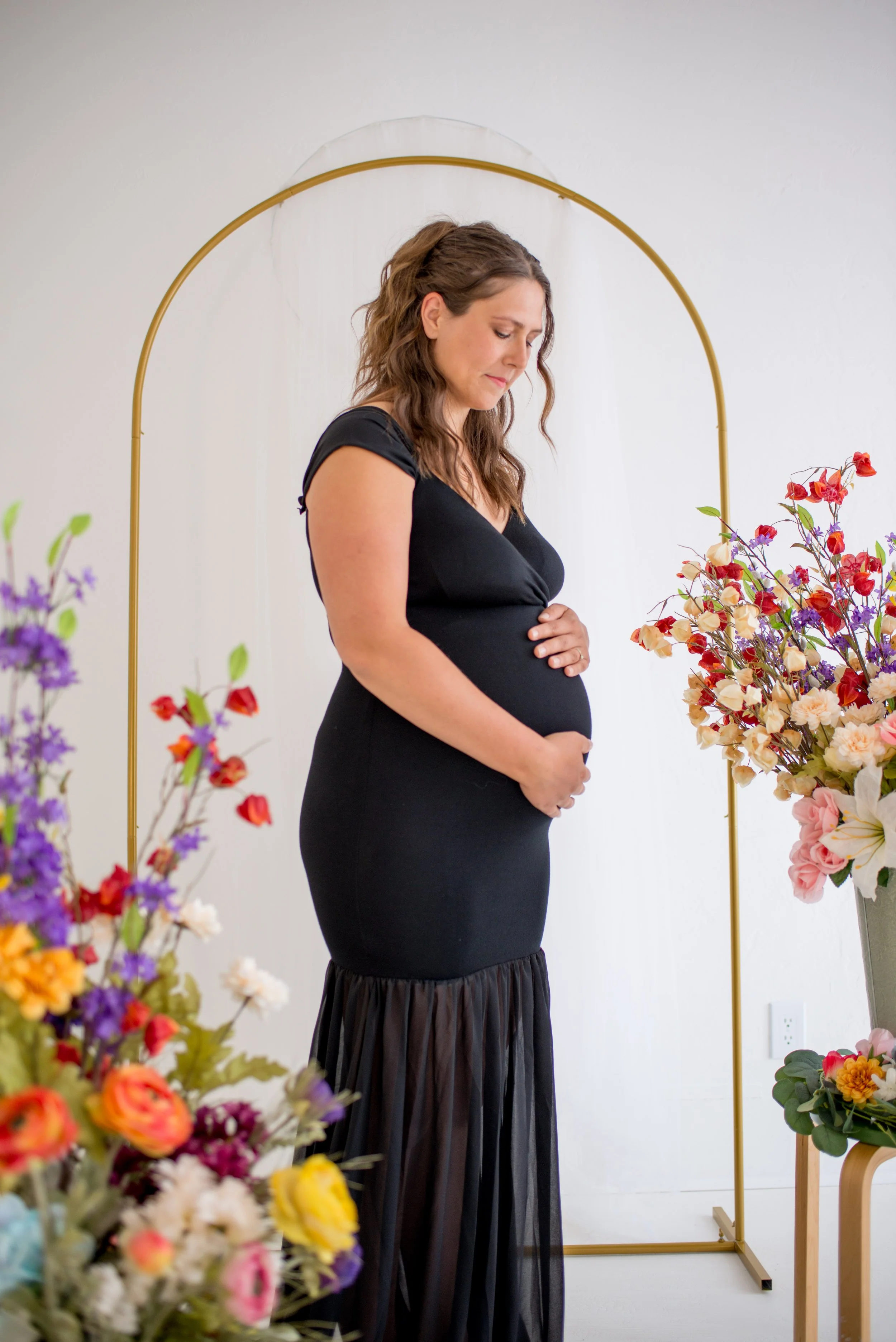
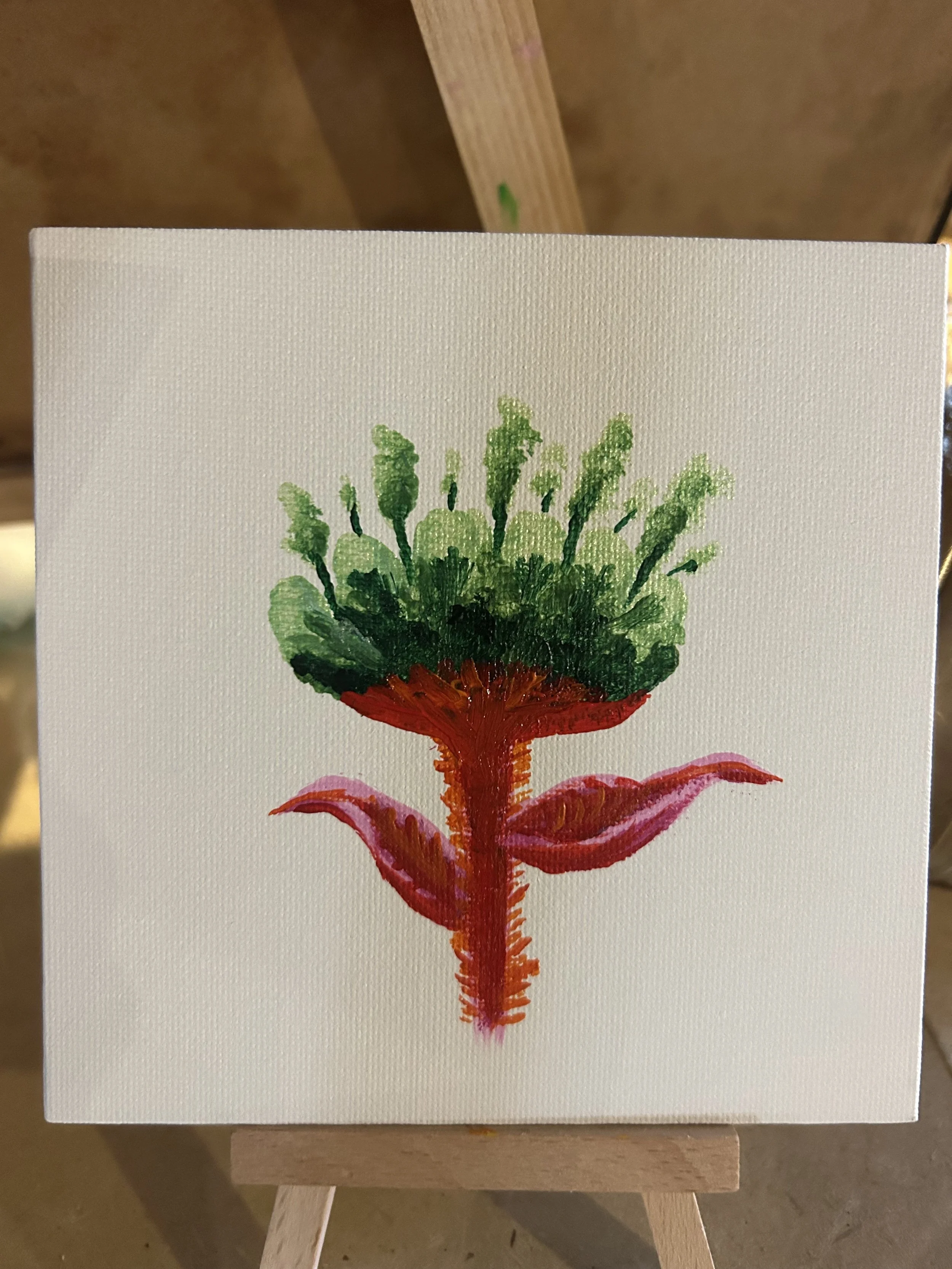
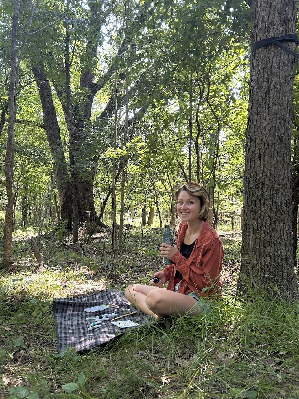
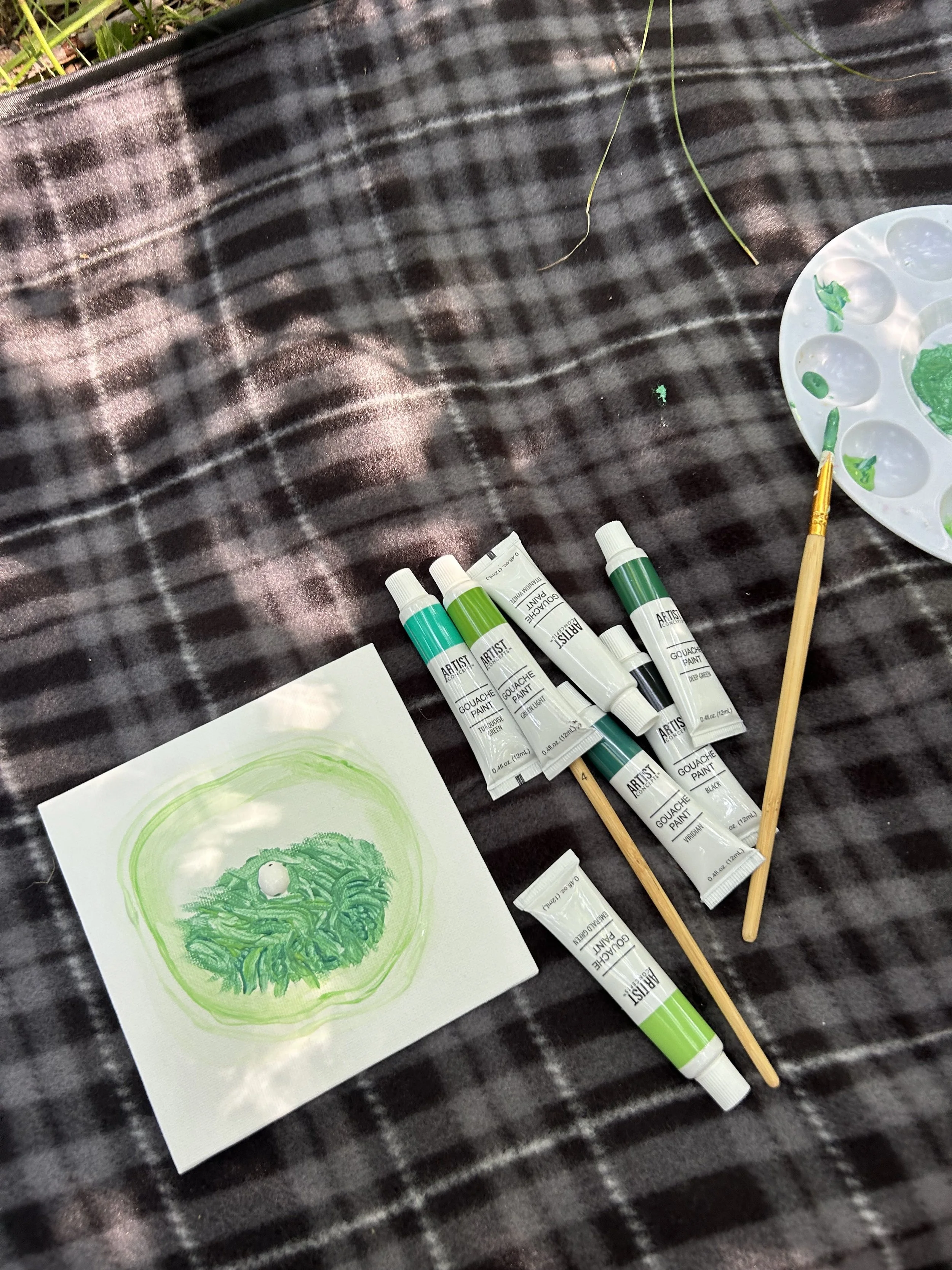
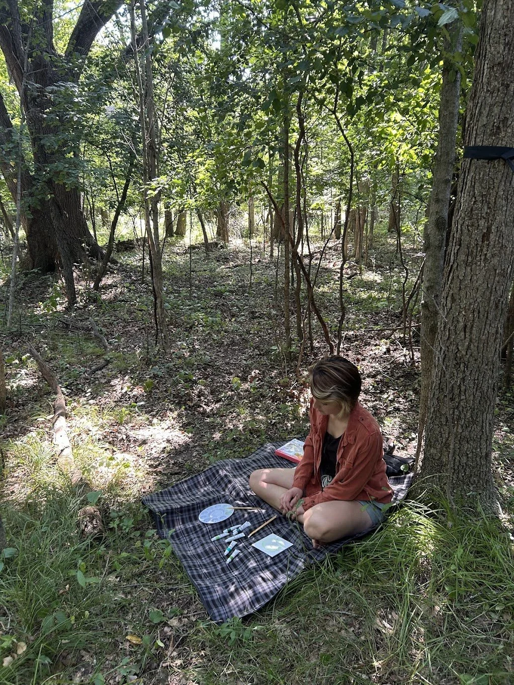
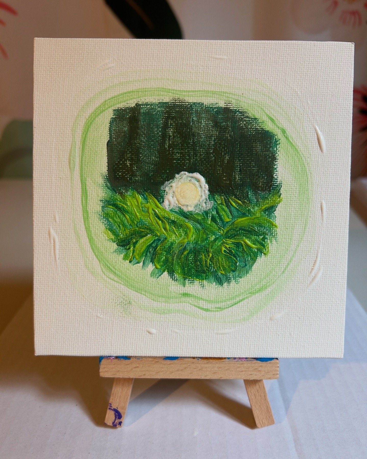
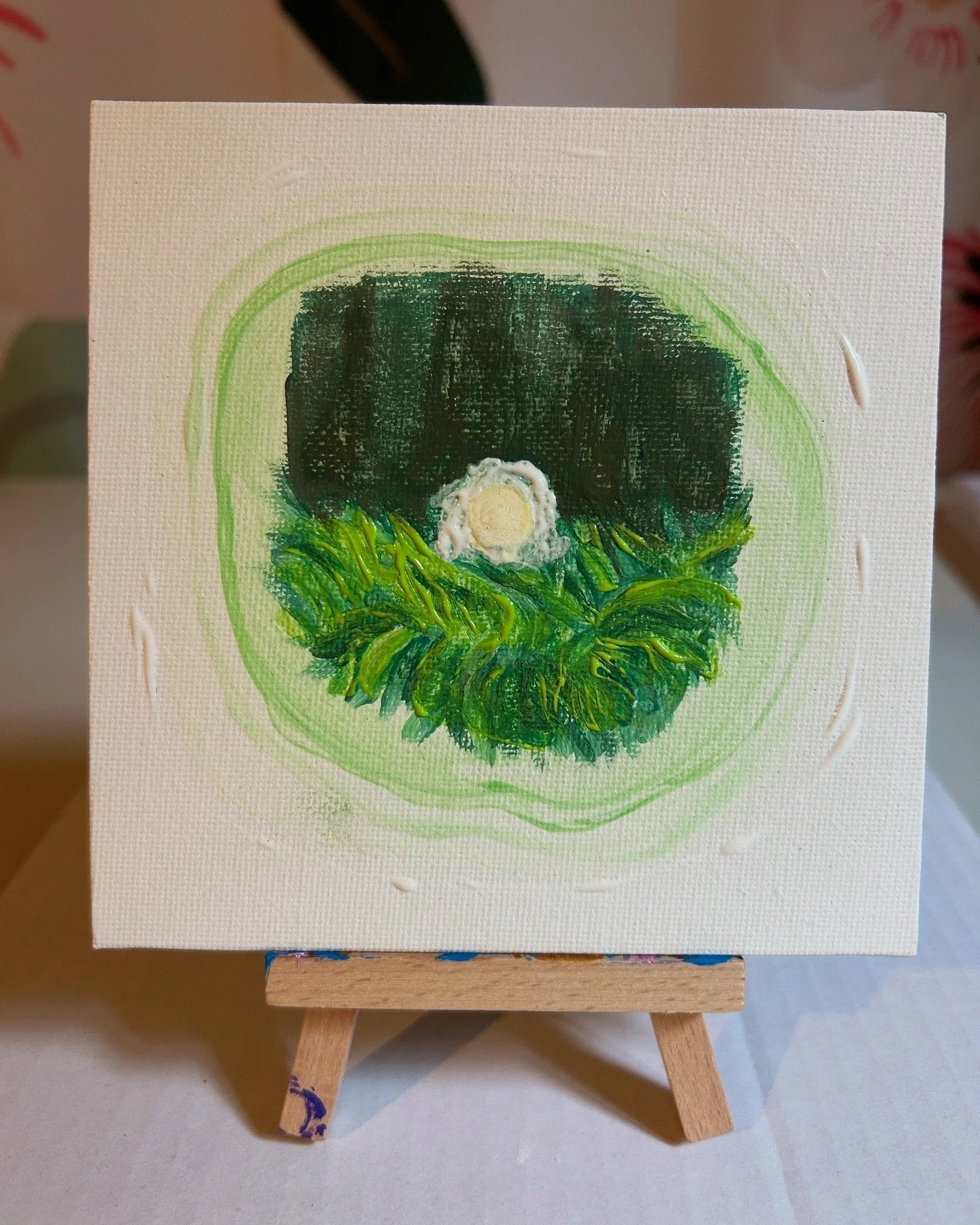
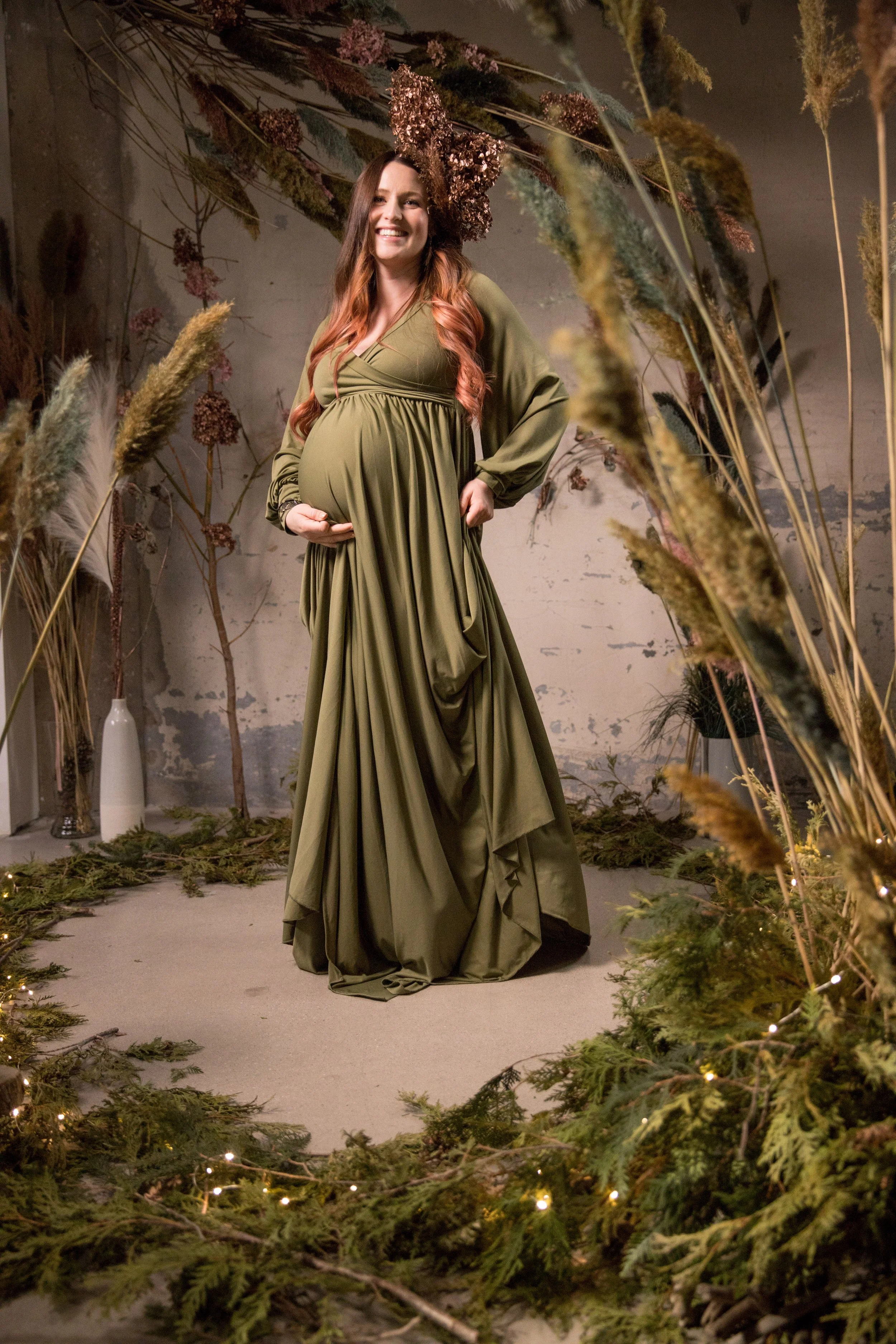
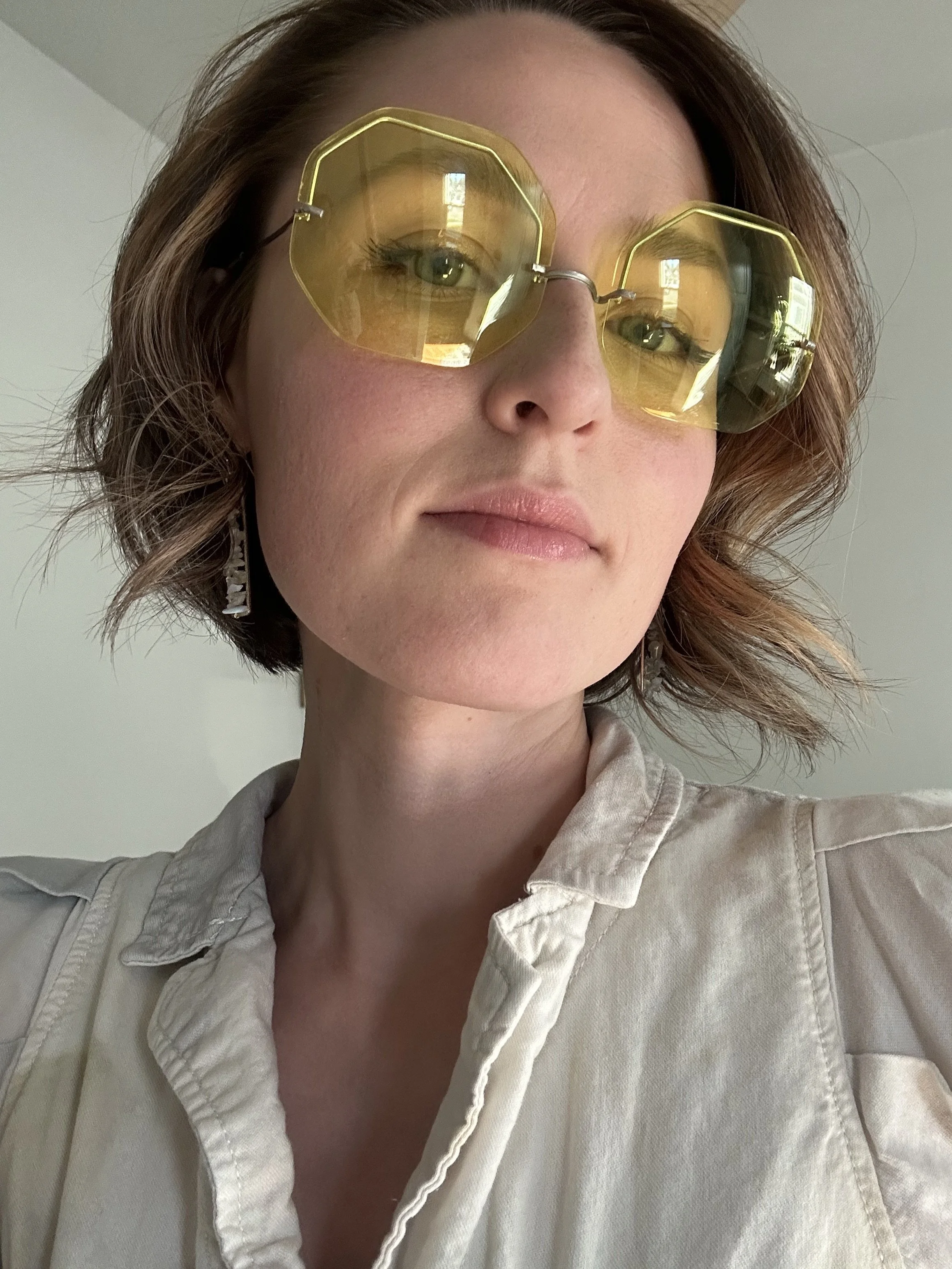
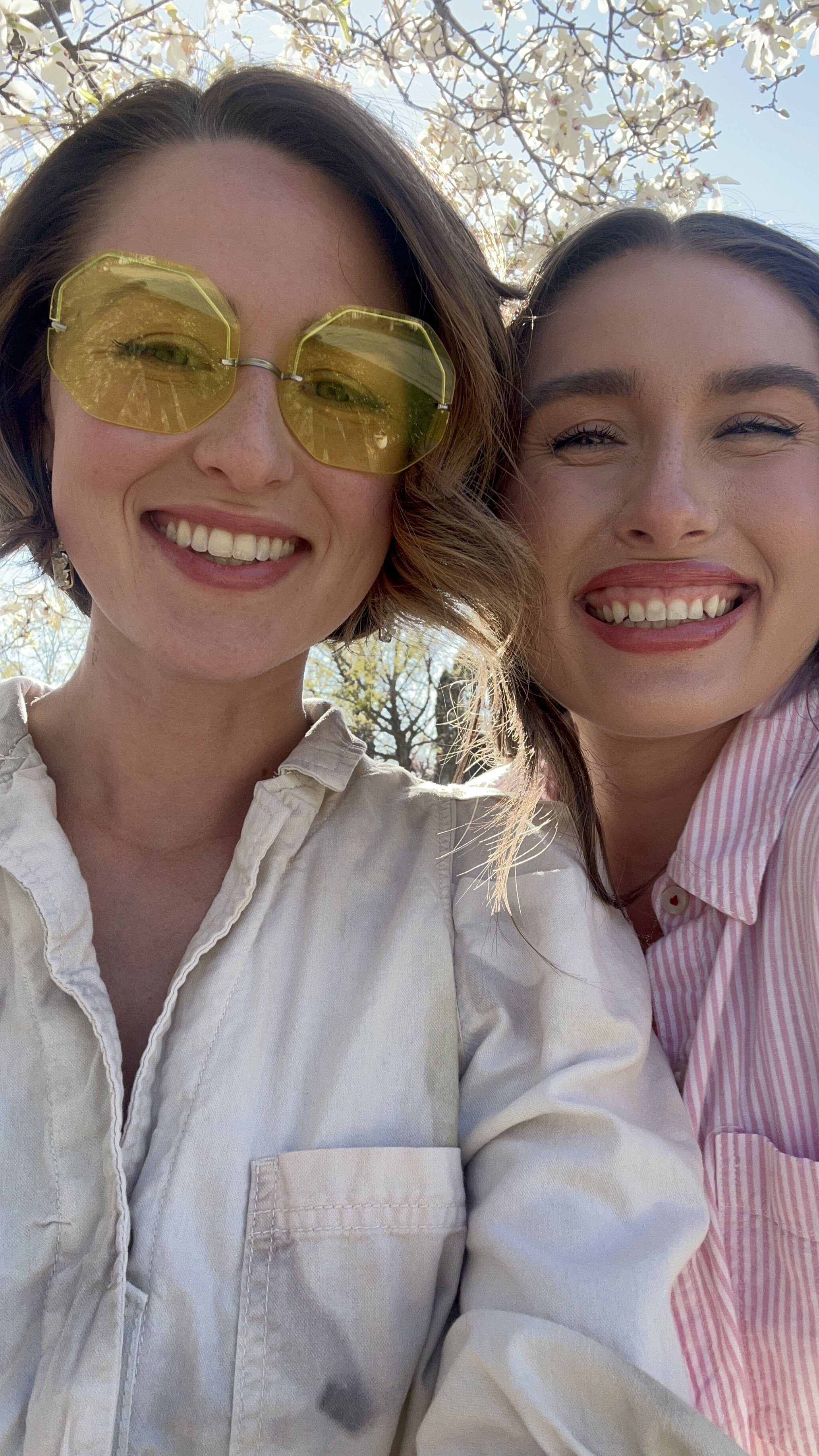
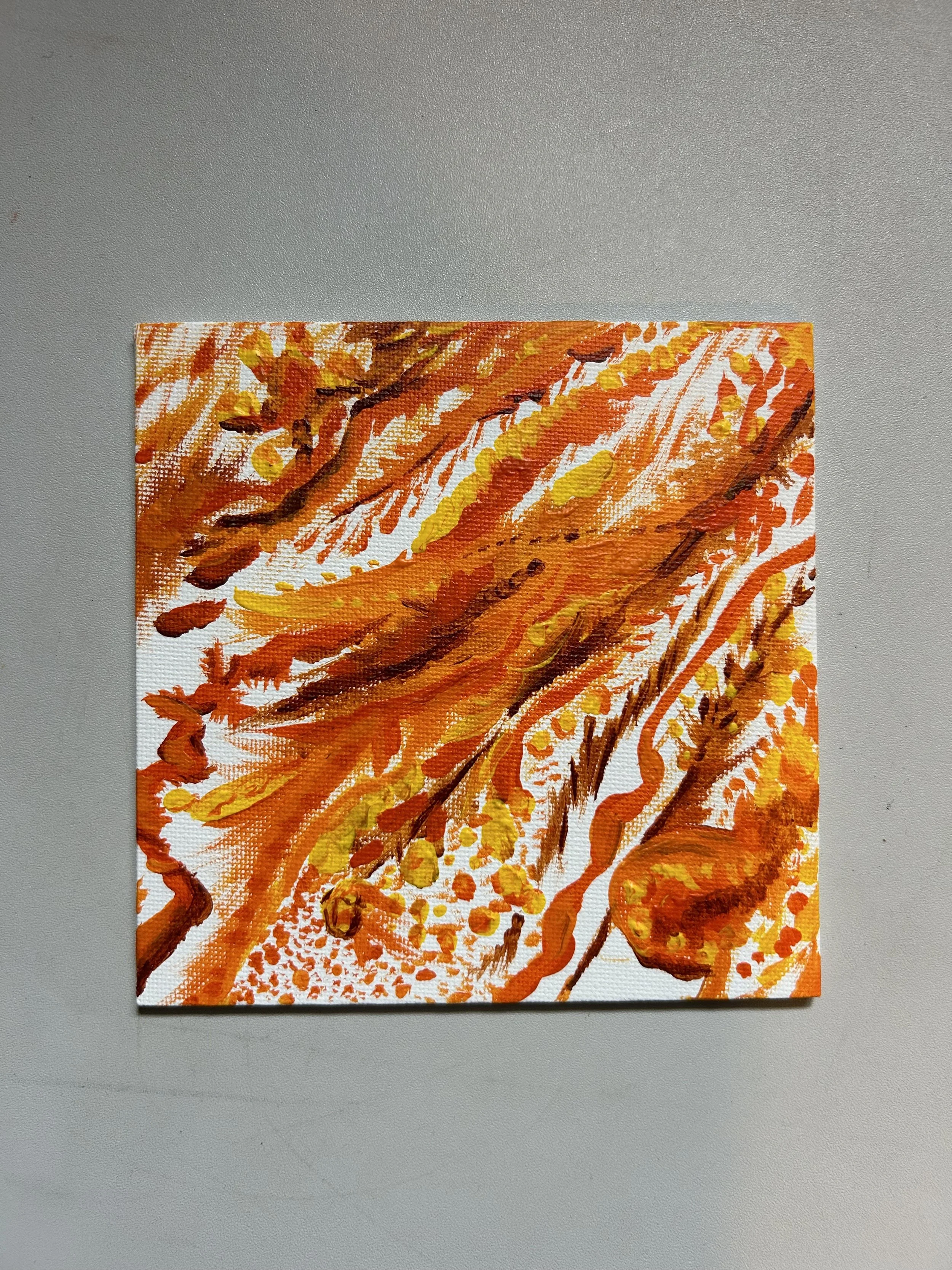
I didn’t do many “big” projects during this purple season. My sketchbook has collected most of my creations of this color. These two were from sketching during church. I’ve actually been working on a rather small-in-size project that has taken up most of my time and energy. Another little surprise of my rainbow year.

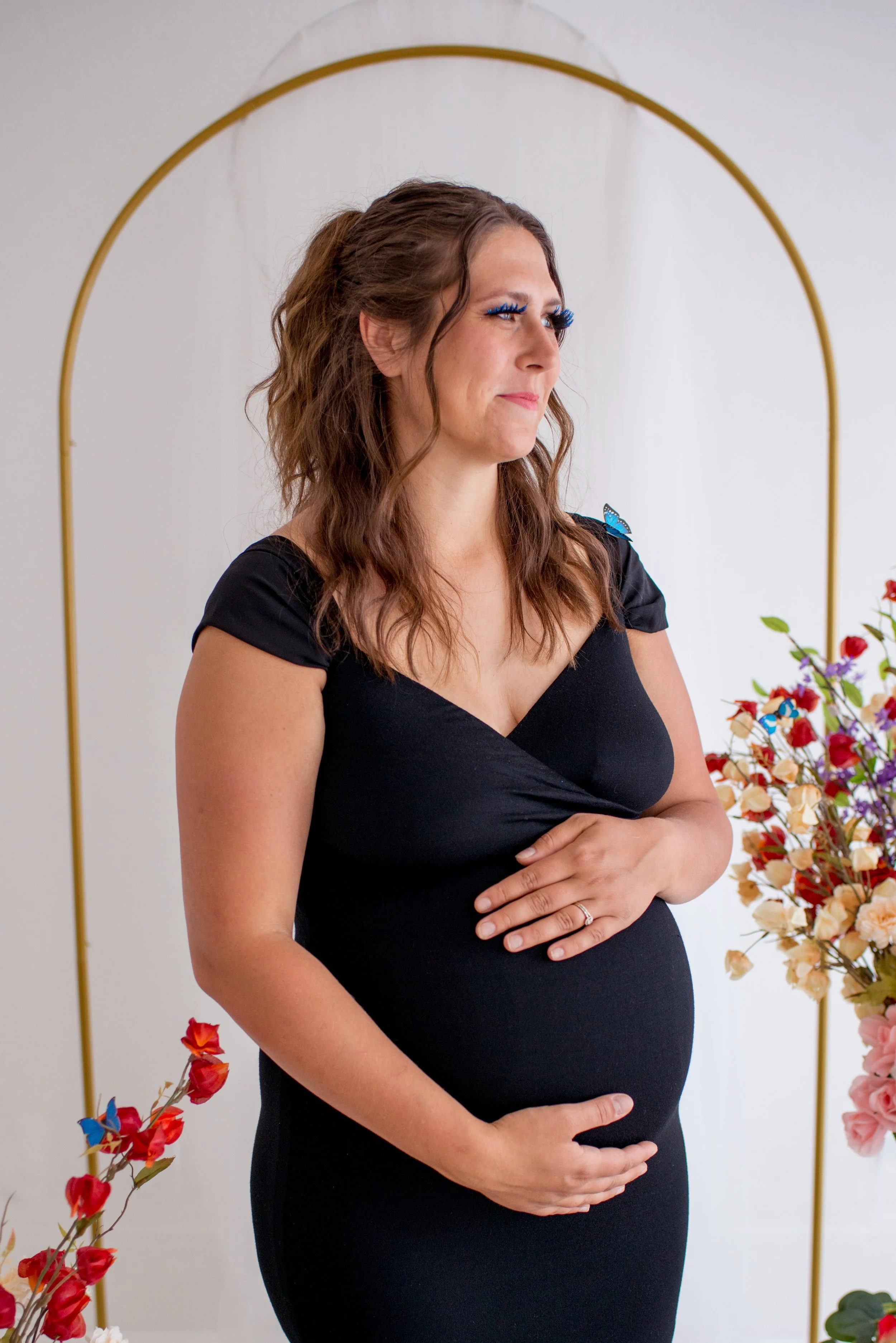
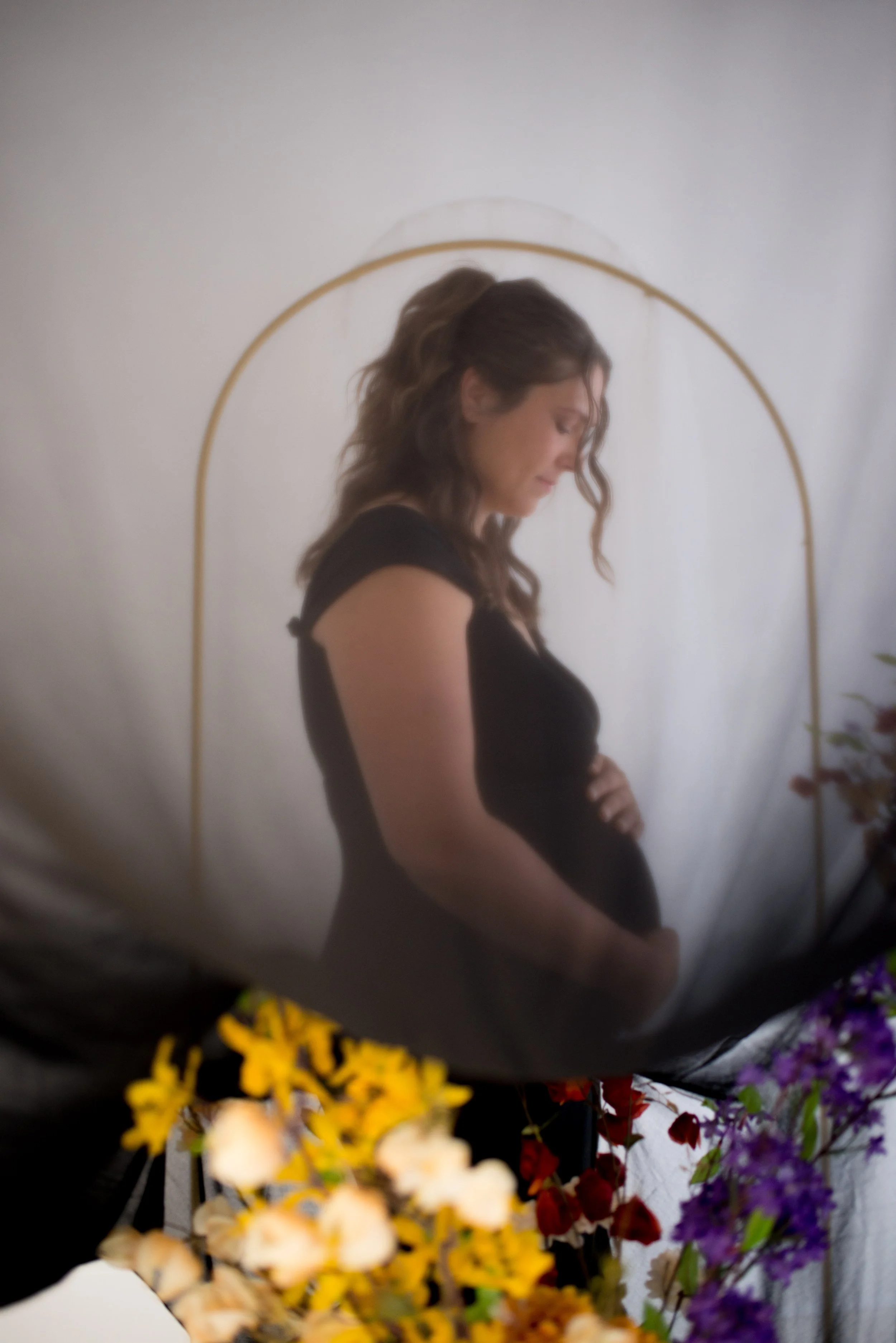
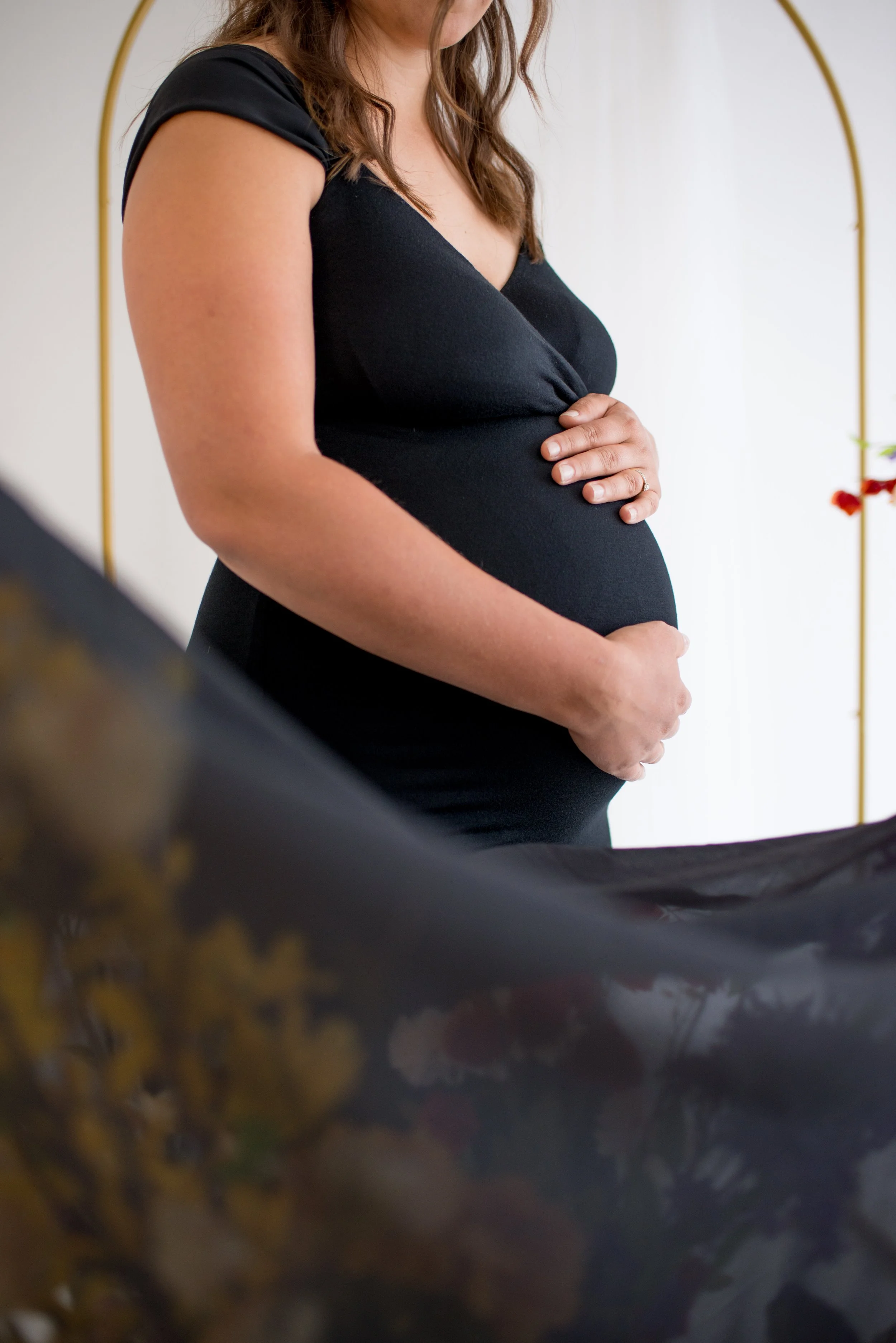
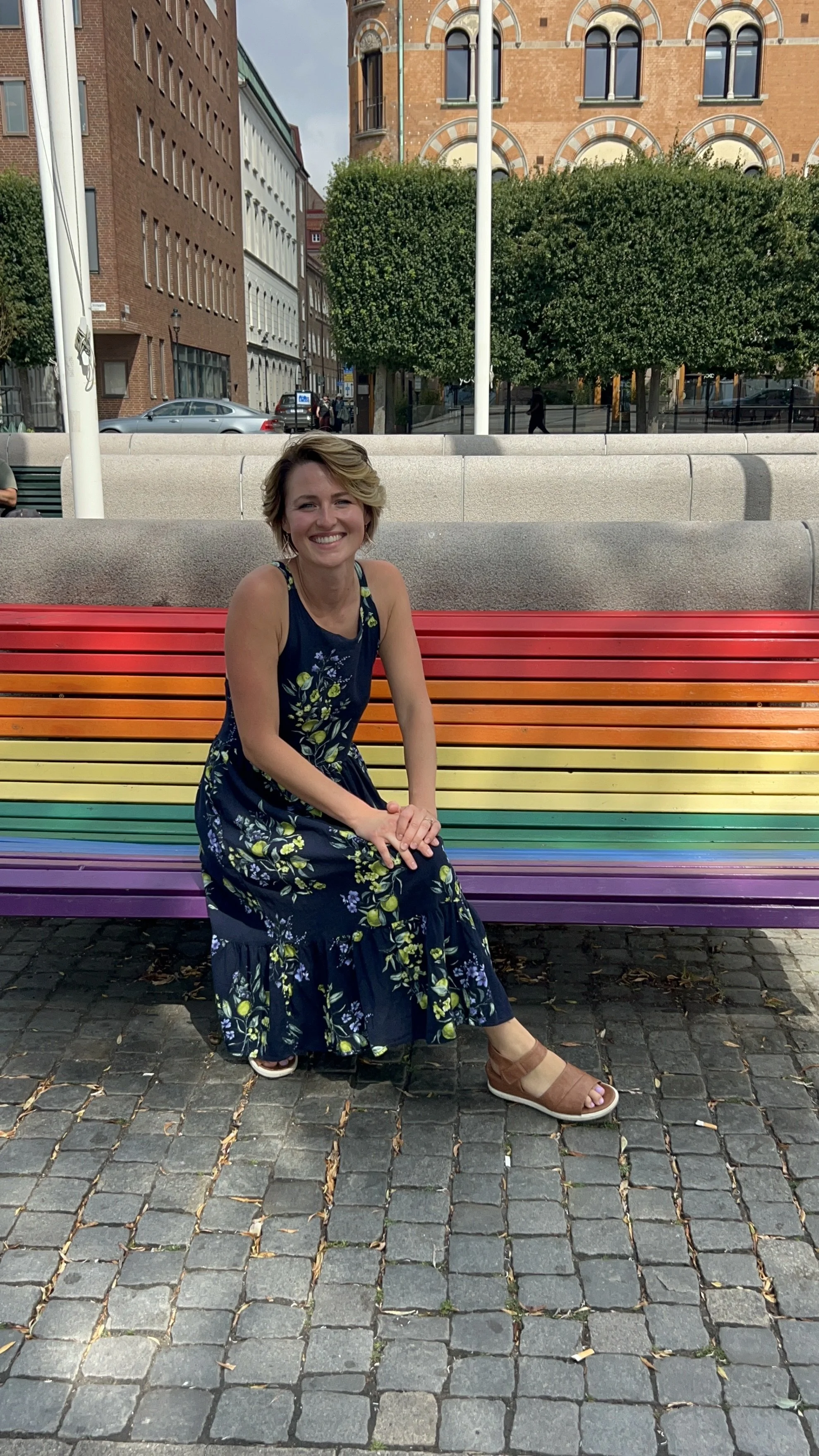
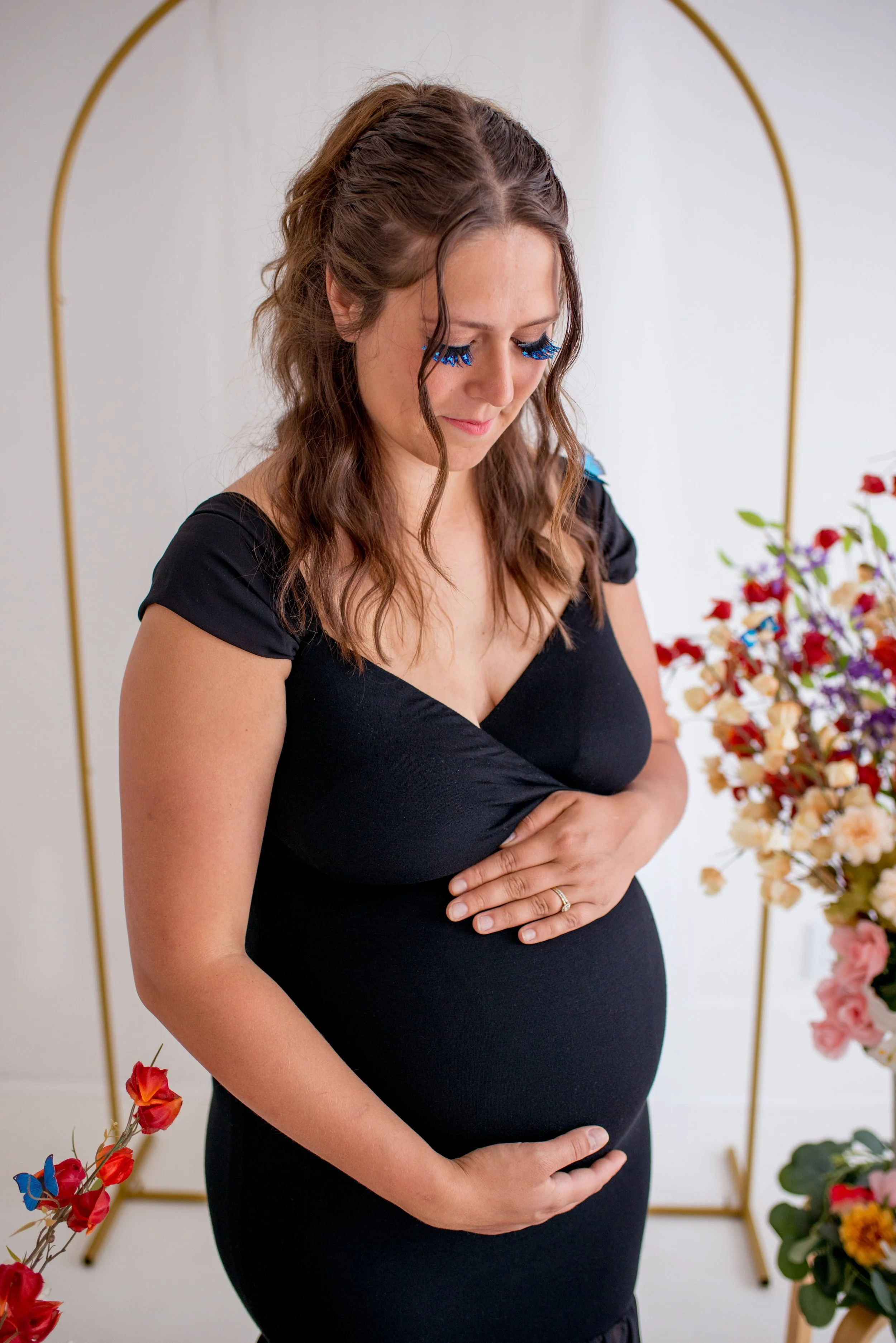
I love this ending to my rainbow year. A rainbow baby. This year has really been bookmarked by my colors, some even with crazy timing if you ask me. I’m thankful to have walked this rainbow to the end. Better than a pot of gold. Happy New Year's Eve everyone. Cheers.

BLUE

So far so blue, I’ve done a pastel drawing, did some documentary style photography of blue things around my house, and started a blue canvas with gouache and copper leafing. Each color I do a pastel, marker, or watercolor “drawing” and at the end of the year I’ll put them all together for a rainbow collection. They are quick little moments at the beginning of each color, almost like an introduction to the color. Hi, how are you? Oh, and don’t forget the blue shark bank project. That was mainly my son’s project, but hey, it’s blue.

These are images of blue items that I found, as I found them, around my house. I was surprised to find this many items, because I don’t think of blue as a color that fills my home. There was more than I would have guessed.

This collection of images reminded me of a photo project I did in the past where I took photos of different rooms and surfaces in four different houses and lined them all up next to each other. It was one big print. It was interesting to see the different personalities belonging to the different houses. I thought it curious how each homeowner gave different rooms more decoration than the others, or how similar some of the rooms were put together. The space of home has always been a passion project for me. Maybe I’ll pick up that project again in the future. More homes to document.

I titled this canvas “Sweet Dreams”. It was a gift. I wanted to do something I’ve never done before, and I ended up doing many things I have never done before. First, I decided to only use a painting knife to apply the gouache. Second, I prayed that this image I was about to make would positively affect the recipient’s sleep. That was out of my comfort zone, but hey, if it actually happens, how amazing would that be. God cares about the little things, even sleep: “for he gives to his beloved sleep.” Psalm 127:2

Third, I decided to accent all the blues with some copper leafing. In the past, I have attached leafing to a canvas via the paint on the canvas. This time I experimented with two different glues. One was Ultrabond, simply because it was what I had on hand from the bouquet project. The other was hot glue. That was inspired from an Instagram video. Fourth, no there’s no fourth. That’s it. 

I have found myself wearing more blue. On purpose, but more like giving into the color because it is my current color. Normally, I like to mix and not match when it comes to colors, patterns, and textures with my style. But during my blue color I have just let all the blues find their place on me at the same time. Not quite monocolor, but almost. It’s fine. I find it a little boring. But I also am finding new outfits within my closet, so that’s rewarding. I also find myself in many complementary surroundings at this time of year. So much orange everywhere. Happy Fall.

Travel: Bahamas

Here are some of the first images from our trip to The Bahamas. At sunrise we were on the plane, and by sunset we were seeing palm trees under the moon. I almost always take photos of our view out the airplane window using the camera on my phone. But this time I decided to whip out my camera and take the shots the old-fashioned way. This trip took place during my photo journal year. That year I used my camera - not the camera on my phone - to take a photo everyday. I missed many days, but I cherish the photos that I have now because of that project.

I’ve always loved a silhouette on a gradient sky. This photo reminds me of a water color project in elementary school that was super basic but apparently rememberable. We water colored with sunset colors. Then when it dried, we ripped it into strips and re-glued it together. Then we added tree silhouettes that we cut out of black paper. I remember thinking, “This is like real art.”


I found myself at the Queen’s Staircase in The Bahamas staring up at this tree that was growing at the very top of a cliff about 100 feet above me. It’s roots were streaming down, bending around rocks and other plants that had made this wall their home.

Imagining how old it was and seeing how long its roots were, Wes and I took a moment and said hi to the tree. Its canopy was a part of the roof of this deep slave-made walkway which was built in the 1790s. It was crazy to see its vast root system and how it thrived even on the edge of a cliff. Resilience. We had a moment with that tree.


For my birthday I told Wes, “I want a no-clock day.” This looked like eating when we were hungry, moving on when we were curious about something else, and resting when we needed a break. One of my favorite days for sure. After breakfast we started our adventure by seeing old military forts. I like old buildings. They spark so much curiosity and mystery. This image makes me chuckle. I see it like the modern day is peeking its head into the corner of the frame. It definitely interrupts any daydreaming of this building’s past.

Doors. I like to take photos through the frame of doors and windows. These stairs remind me of some Nancy Drew books I used to read as a kid. The middle image was taken right up agains the fort’s wall, looking straight up. “What a place to live.” The third image falls more under the abstract photography category with no real idea for scale. In real life this plant is growing in a very small hole in the wall. But in the frame, it almost looks like the entrance to a long forgotten cave. You could probably discover some secret treasures in there, if you can get past the green guardian creature at the mouth of the cave.


Recently I asked small group of people, “So what are some of your interesting curiosities?” The conversation went from Egypt (that was me), to Egypt again (that was someone else), to ticks and disease, and then to rockets and space. On my mental list of curiosities, right next to Egypt is Atlantis. Anything about it. So, when Wes and I were throwing ideas around for a birthday trip, Atlantis was one of those “I’ll just say it, but we wouldn’t actually go there. That’d be too big” ideas. Well, sometimes dreams come true. I’m not sure what my younger self would think if I told her she was going to go to that one resort in that Mary Kate and Ashley movie. So crazy.

One of my favorite parts of being at Atlantis was being surrounded by so much intentional detail. From the buildings, to the walking paths, and the gardens, not to mention the open air marine habitats. And the waterslides. I’m not usually one for waterparks. I think I’ve never liked standing in line for long periods of time, dripping wet. Not my favorite type of fun. But I will say, the waterslides at Atlantis were worth it. So fun. One slide in particular had that once-in-a-lifetime feel to it. You go down on inner tubes, and at the end of the ride you find yourself inside a shark tank. You are riding the water down the middle of a glass tube through the sharks’ pool. Sharks above you, below you, on your sides. You get it. After the waterpark was closed, I remember waiting awkwardly-long to take that picture of the shark swimming by the window of the waterslide. Now back to the epic-ness of Atlantis. Everything was so carefully created. It was magical being surrounded on every side by that level of design. Wes and I found ourselves repeatedly talking about Glory. So, I guess you could say it was a glorious experience.

GREEN

I was so excited for this color. It is, after all, my favorite one. Growth. Newness. New life. I’m typically always up for trying something new. The excitement and mystery that can come with newness has almost always made me more comfortable with change than most people. I see growth as creation. The act that is most organic to us as humans: creating. Not everyone likes to think of themselves as a “creative”, but I think everybody has the capacity, just maybe not the exposure or practice to see themselves as a creative, yet. It’s like a room in your house you just haven’t spent much time in. Or other times I talk to people that don’t think of themselves as creative, yet they are business owners, homemakers, and really good with creating systems. That’s all creating. Absolutely. 

I continued the mark making series, this time in Green. Marker this time. Not as exciting as pastel, because I realized I didn’t even have anymore green pastel. And I played around with the idea of inverting a flower, with the color green as the show stopper color for the petals. At this time of year it is easy to immerse myself in my current color. All the lush leaves and greenery are not hard to find. I found myself going out of my way to be among the green a bit more than usual.

Ironically, I started a project with very not-alive flowers that were part of a dried bouquet. A friend asked me to do a shadowbox with her vows and her dried wedding bouquet. Sure, why not! A bit of a learning curve, but I was happy with the finished product and most importantly my friend was, too. Another project I did was a small painting in which I only used green paints. I started it while I was outside in the greenery of the woods.

This project is special because of where the idea came from. This painting is a small part a prayer, a most part a documentation for remembrance, and another small part a process of grief. It’s kinda crazy that in my green season in this rainbow year, this two month window, I found myself pregnant. A literal new life. It was a very surreal experience. Wes and I were grateful, excited, and then floored when I started bleeding. We miscarried. I’ve experienced many types of loss in my 30 years here, and this was my second time experiencing this type of loss. It was different this time. It happened earlier on than my second pregnancy. The event felt quieter this time, because not many people knew we were expecting. Alongside the sadness and other assumed emotions to belong to this sort of thing, I found myself grateful. That surprised me. I couldn’t get away from the weight that I was blessed to carry that life. It felt like a gift. Short lived, but significant all the same. I’m still not sure if this image I saw in my heart that I tried to put on canvas, was the child we never got to meet or if it is a possible future kid that hope is holding. I guess time will tell.

One last share from my green season, I found myself in Sweden. Long story, so make sure to check back for my travel blog about it, but I snapped this photo. You get it. Just had to.

Art School

Once upon a time in art school, a professor announced to all of the almost graduated, “Take everything you have made in the past four years and throw it away.” He was challenging us to move on from these beginning works and encouraging us to keep making art. Make new art. Better art. Here are some of the art pieces that I should have thrown away. I didn’t.

My Green Year Narrative Session

My color for the year at this time was Green. The color green meaning new life and growth. That year I walked through some new life in many different forms, but one of my favorites was in the form of a baby.

This was a collaboration with my photographer friend Rebecca Reale. I brought her my idea of a photography shoot all about my color of the year emphasis on my baby bump. We shared so many pins on Pinterest and then finally landed on a warm earthy style, with natural textures, but also with some pops of rose gold. That was mainly because my hair was rose gold at the time.

The studio had little to no widows, so we knew we would be working with studio lighting. Check. Now we needed the set. We ended up spray painting and foraging. Our foraging looked like cutting down those tall pampas grasses you see on the side of the road. Spray painting them, each side. And then arranging them around the space. One of our favorite moments of the set was the hanging branch.

Because of this project I realized how much I like spraying metallic paints on organic things like flowers. The gilded look was perfect. It took this dried up crunchy thing and turned it into a centerpiece. Naturally, I put it in my hair as a type of jewelry. The circle of evergreens on the floor was all Rebecca. She told me it reminded her of different birth rituals. Her favorite one looking like surrounding an expectant mother and praying for her and the baby. It became a prayer circle. The evergreens match that very nicely if you ask me. Prayer sometimes feel like an evergreen branch: ever prayed, ever heard, ever present, ever good-wishing.

Now for some movement. This green dress was perfect for a good ol’ skirt throw around. It wanted to make sure green for the dress was going to blend well with the other elements within the frame because I wanted this to read “nature” event though we were in a pretty industrial setting. That brings me to our narrative for this project.

So here’s the narrative: no matter what your current setting is, life is stronger than we think and it can bloom even in the harshest of circumstances. The image of a flower growing in the crack of a sidewalk comes to mind. This project was a celebration of life. In the big ways like the new life of a baby, but also in the small ways like waking up and living this life even after someone you loved is no longer with you. This was the pregnancy after my dad Dean passed away. This would be the second child of mine that he didn’t get to meet. Sadness. And life keeps going. Life is all around, and it thrives even when sometimes you think it shouldn’t. I told Rebecca I wanted to do green, natural, feminine, and celebrate new life. I think we got it.

YELLOW

I did my first yellow picture yesterday. It was a watercolor. Thinking about the color yellow I wanted to use watercolor because of how light the color yellow is when you use it on paper, specifically watercolor, so that I could layer it on top of itself and try to get more pigment and play with that gradient. The image reminds me of honey. The sweetness and healing properties of honey are pretty amazing.

I also did a photo shoot with some yellow sunglasses that used to be my grandma's. These glasses have interchangeable lenses with different color options. I chose the yellow lenses.

There were some trees in bloom and I wanted to capture them before the blooms turned to leaves, and with my yellow sunglasses and my yellow heels, I went with my sister Mia and we had a very fun time. My life hasn’t really felt like it matches the color yellow these first six days of May. The same day that my yellow chapter had started, I caught wind that a close friend was going through a tragedy, or in her words “a nightmare.” On top of this, my first day into yellow I found myself at my dad’s funeral. I feel sadness and loss and all the things opposite of what the color yellow means. Yellow represents friendship, joy, laughter, gold. It also means purification. I also think of yellow stoplights. A transition color, a yielding. Thinking about the color, yellow, and what it all means, and more specifically what it means to me right now, I can’t help but think about the tension between the joy of life amidst the sorrow of life. I think it’s a superpower to be able to grieve and celebrate within the same day. As I think of yellow, I think of it as yielding to or giving into moments of joy, laughter, friendship and welcoming those moments in every season of life. In the end, I think this could look like a purification process. Maybe even “how to” for uncovering glory. Catch me yielding to yellow.

ORANGE

Rhema asked me to sketch for her. She likes to watch me draw. I love it. Sometimes I wonder if her interests are her interests or if they are my interests. If she actually likes to cook and draw and paint and colors and clothes or if that’s just my influence. Either way, I know she enjoys it. I drew this vase that I got at the thrift store for my 30th birthday party. I don’t know if I’m gonna keep it. This drawing might be a documentation of the thing that I once owned.


I went to start my orange pastel project today, only to find out I don’t have an orange pastel in my case. I must’ve used it all up on my project in college. I think it was the huge pastel landscape of a man sticking his head out of a train window, enjoying the ride in the breeze, in the trees. So that’s why you see paint.

Learning more about what the biblical meaning of colors are, I looked up at orange and the first word I read was “deliverance”. Right under it is “passionate praise”. I started painting as I like to, by outlining the ripped edge of the paper. I don’t mind if the paper ripped out my sketchbook has a ripped edge because it gives me a place to start. It helps me start the project and then I think it helps me flow sooner.

As I started my orange line, I started on the top of the rip in the middle of the left side of the paper and worked my way down then I started back on the top and just started going with it. I was thinking of the idea of praise, the question of deliverance, “what is deliverance?” and about deliverance and praise together. Then I thought of praise and I thought of it as a bubbling up. So, I started with swirls at the bottom of the page. I worked my way up towards the top through the center: praise rising up. Then I just started following the lines. I tried to reserve the metallic copper color for anything I felt was a little bit extra, God influencing, glory, or possibly holy.

The little detailed pockets reminded me of anatomy again, but also landscape. The landscape on the left reminds me of volcanoes. It looks like a field of volcanoes, which then reminded me of eruption and bubbling up again. Another of the themes: eruption, interrupting, praise, passionate praise like a volcano. And then I could see it more. It’s a chest cavity again. It’s a spine. The three lines on the top remind me of the Trinity, breath of God, and his praise and deliverance are occurring in the body. Whatever that looks like, praise erupts.

For the top right lines, I was conscious of the fact that our mouth would be praise and singing or words or something, and that it would be coming out of the mouth, breathed by the breath of God. The bottom right corner, a candle holder, and a flame almost reminded me of a bottle shape with a candle on top and a flame: deliverance, praise, or representative of the fire of God. The actual color “orange” is made by mixing the red meaning and the yellow meaning which when you mix red, which is flesh and mix yellow, which is the fire or purification, then you end up with orange meaning the fire of God.


I have some people that I get together with to talk about our creative projects that we are working on. One time that we met, I surprised everyone with a painting night. Painters and non-painters, let’s paint. This is my project from that night. I used oranges as I was in my Orange months during my rainbow year. It reminds me of Fall leaves that fall. Seasons changing. New textures and sounds to rediscover.

RED

When I was starting this project with the color red, I was a little intimidated to start, because I haven’t made anything with more than a pencil in a long time. Most of the images that I sketch or create are just with my pencil and sometimes a black pen, so diving into color right away felt like anything could happen.

I was quickly discovering that the color that you use really changes how lines and shapes are read on the paper. I couldn’t get away from the thought, “this really looks like I’m drawing flesh.” Red communicates blood, but as I was drawing, I was trying to think of anything else, but it was hard too. Then the next day my dad died. I couldn’t believe how timely this project was.

Looking back at the picture it was hard not to see lungs filling up with blood. I was shocked and wondered if I really could have already started processing my dad’s death the day before. I found myself in a prepared space. And that made me feel safe and hopeful and protected and loved. I didn’t create much more than that in my red phase. The other drawings were more doodles. But I was definitely in grief throughout the rest of my red color season.

Rainbow Year

Here is where we begin the Rainbow Year adventure. In previous years I have had a color for that year that would guide my reflections, my choices, and my wonderings. It would be one color for all four seasons.

This year was different. Thinking about what 2025 was going to look like, as if I could know at all, I had the impression that it was going to be colorful. Hard to pick. A wild ride.

And with that I told my husband, “I think it’s going to be all the colors. My rainbow year.”

Not sure at first if it was going to be all the colors together as in a rainbow for the whole live-long year, or if it was going to have some sort of pattern to it, I decided to follow the rainbow and see what was waiting for me at the end.

Hardly anything is as rewarding at the end compared to all the gems collected on the way there.

So, here I am. Walking through the rainbow two months at a time. Works out really well if we just call it purple. Two months to a color. It’s hard to get away from the original meaning of the rainbow: a promise from God to not totally flood the earth again. With the color meanings and the phrase “promises of God” I set off to chase the rainbow.

So far, I have seen more actual rainbows in the sky this year than I have in the past 10 years. So much promise.