


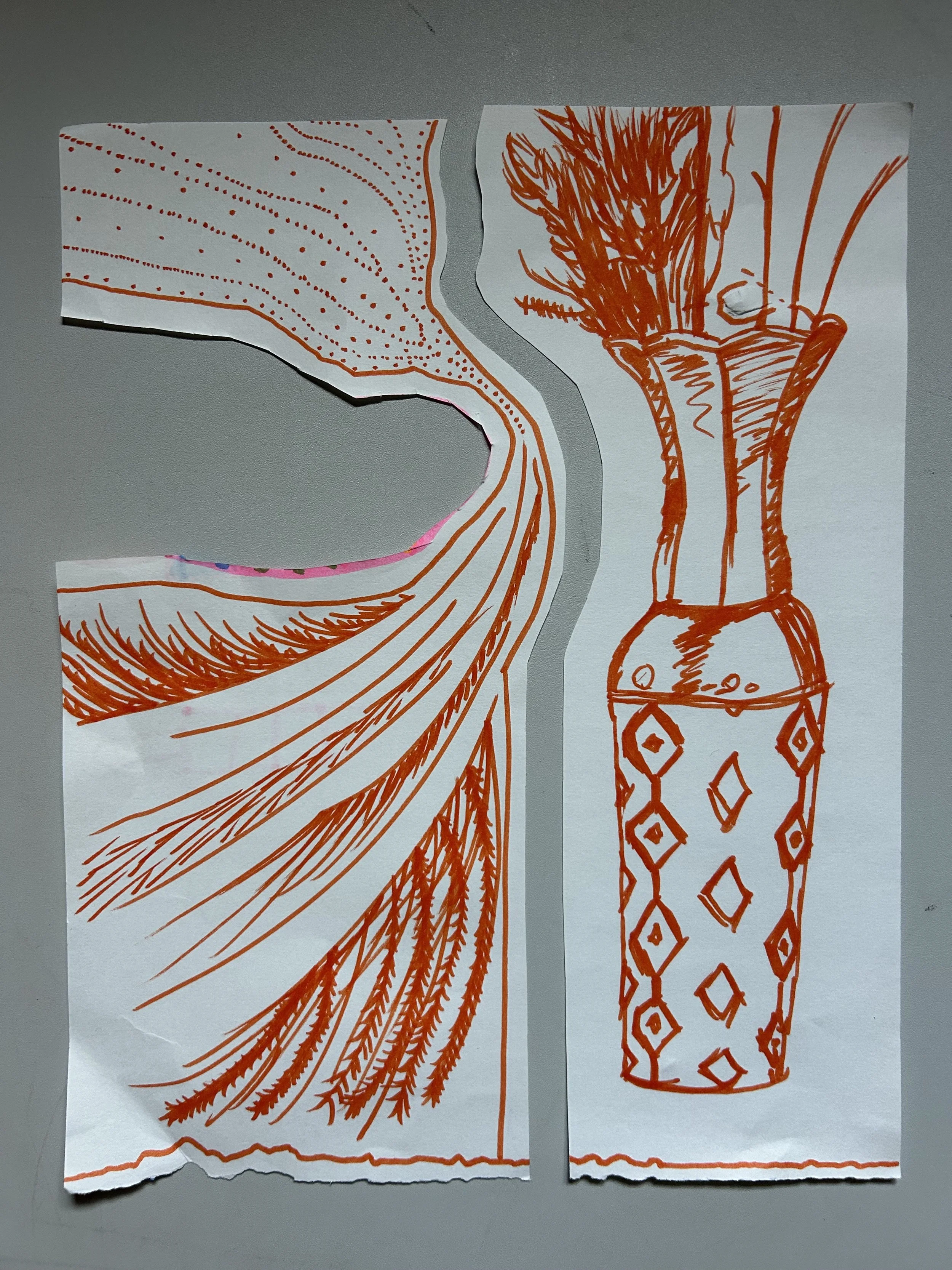
Rhema asked me to sketch for her. She likes to watch me draw. I love it. Sometimes I wonder if her interests are her interests or if they are my interests. If she actually likes to cook and draw and paint and colors and clothes or if that’s just my influence. Either way, I know she enjoys it. I drew this vase that I got at the thrift store for my 30th birthday party. I don’t know if I’m gonna keep it. This drawing might be a documentation of the thing that I once owned.
I went to start my orange pastel project today, only to find out I don’t have an orange pastel in my case. I must’ve used it all up on my project in college. I think it was the huge pastel landscape of a man sticking his head out of a train window, enjoying the ride in the breeze, in the trees. So that’s why you see paint.
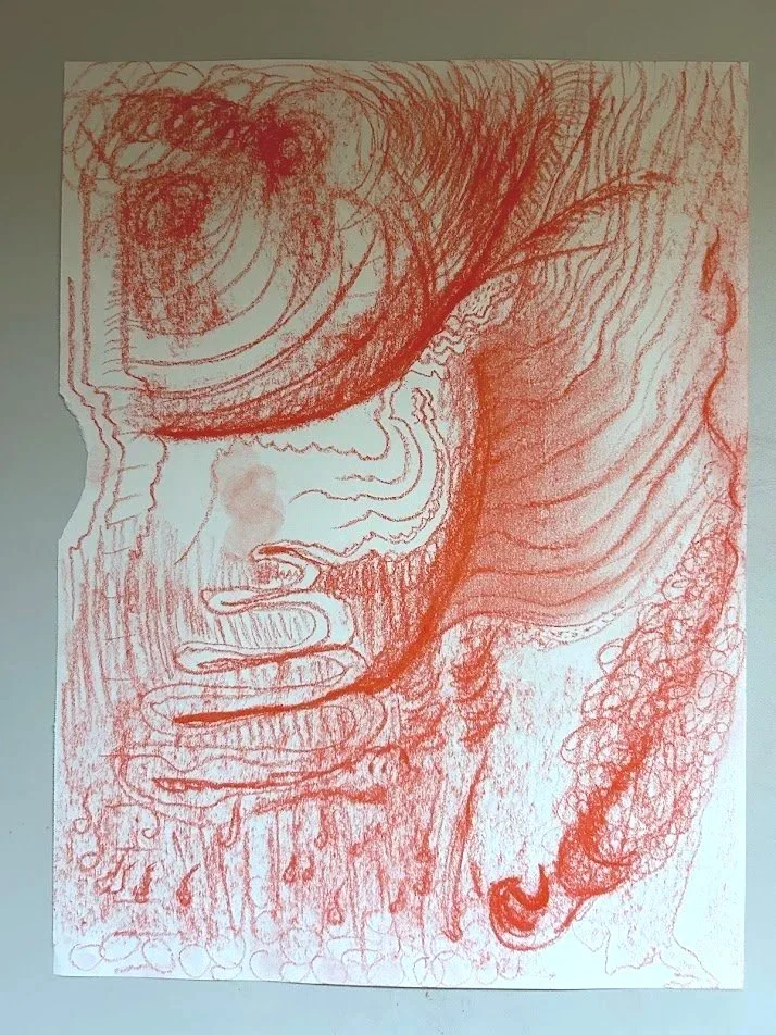
Learning more about what the biblical meaning of colors are, I looked up at orange and the first word I read was “deliverance”. Right under it is “passionate praise”. I started painting as I like to, by outlining the ripped edge of the paper. I don’t mind if the paper ripped out my sketchbook has a ripped edge because it gives me a place to start. It helps me start the project and then I think it helps me flow sooner.
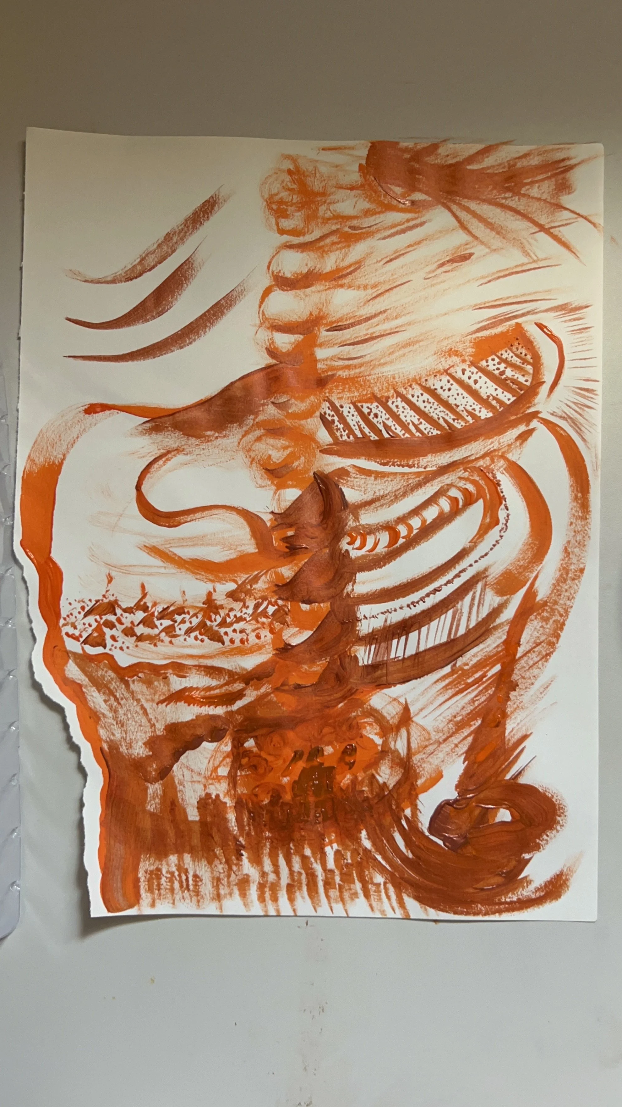
As I started my orange line, I started on the top of the rip in the middle of the left side of the paper and worked my way down then I started back on the top and just started going with it. I was thinking of the idea of praise, the question of deliverance, “what is deliverance?” and about deliverance and praise together. Then I thought of praise and I thought of it as a bubbling up. So, I started with swirls at the bottom of the page. I worked my way up towards the top through the center: praise rising up. Then I just started following the lines. I tried to reserve the metallic copper color for anything I felt was a little bit extra, God influencing, glory, or possibly holy.
The little detailed pockets reminded me of anatomy again, but also landscape. The landscape on the left reminds me of volcanoes. It looks like a field of volcanoes, which then reminded me of eruption and bubbling up again. Another of the themes: eruption, interrupting, praise, passionate praise like a volcano. And then I could see it more. It’s a chest cavity again. It’s a spine. The three lines on the top remind me of the Trinity, breath of God, and his praise and deliverance are occurring in the body. Whatever that looks like, praise erupts.
For the top right lines, I was conscious of the fact that our mouth would be praise and singing or words or something, and that it would be coming out of the mouth, breathed by the breath of God. The bottom right corner, a candle holder, and a flame almost reminded me of a bottle shape with a candle on top and a flame: deliverance, praise, or representative of the fire of God. The actual color “orange” is made by mixing the red meaning and the yellow meaning which when you mix red, which is flesh and mix yellow, which is the fire or purification, then you end up with orange meaning the fire of God.
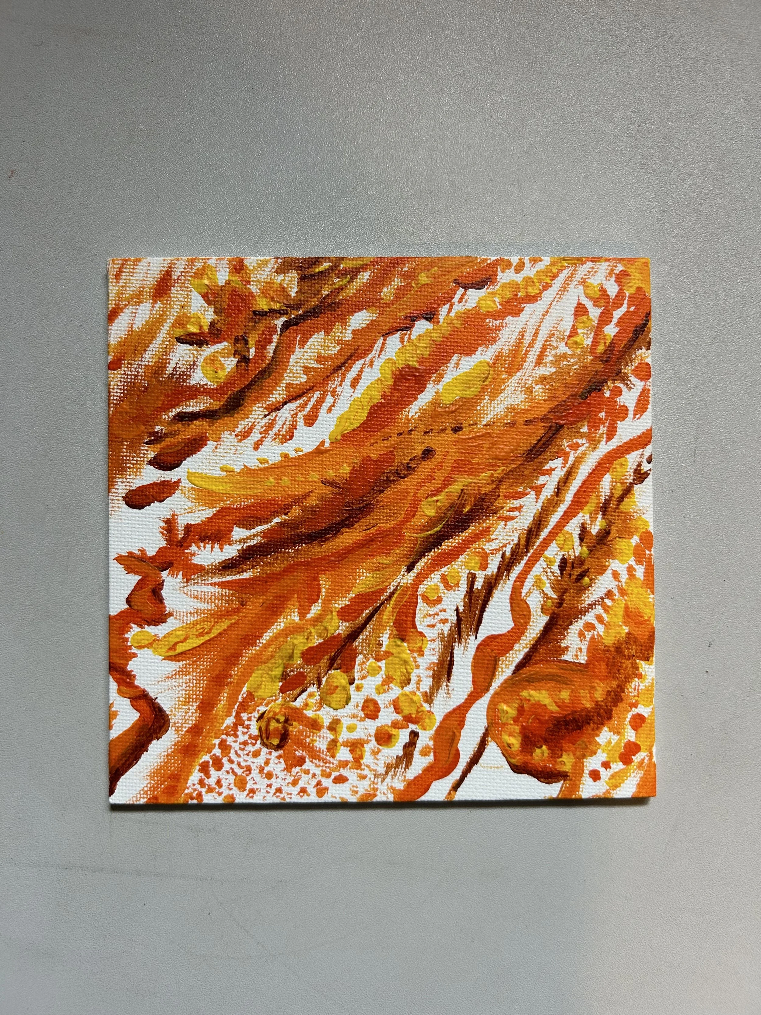
I have some people that I get together with to talk about our creative projects that we are working on. One time that we met, I surprised everyone with a painting night. Painters and non-painters, let’s paint. This is my project from that night. I used oranges as I was in my Orange months during my rainbow year. It reminds me of Fall leaves that fall. Seasons changing. New textures and sounds to rediscover.