


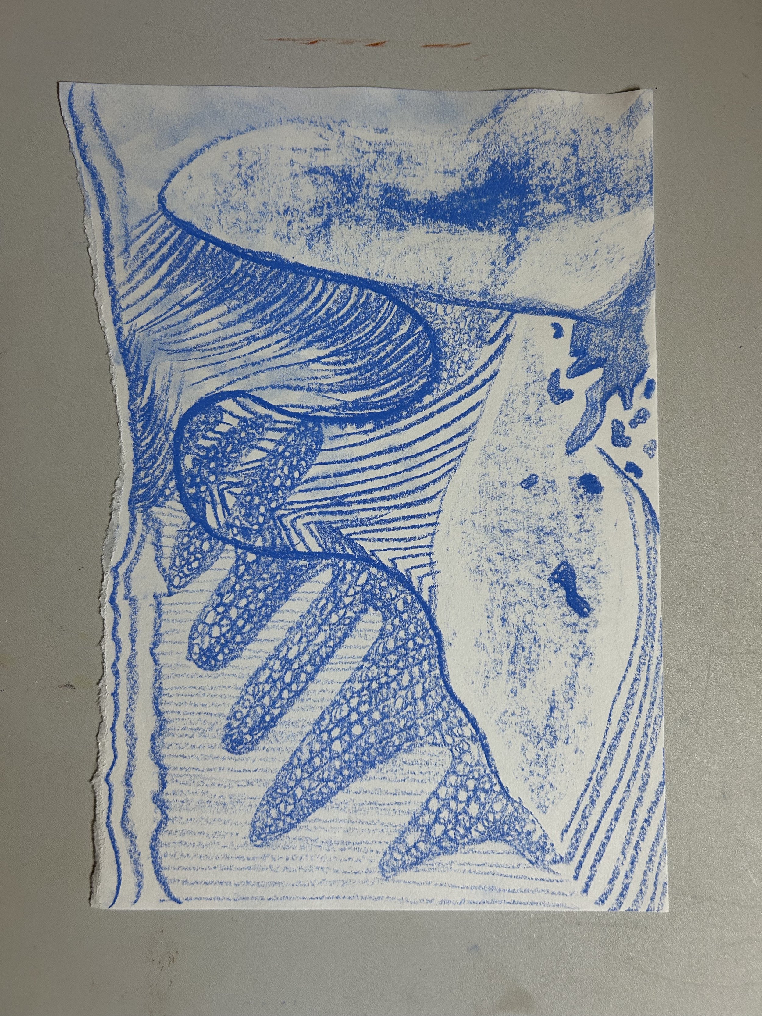
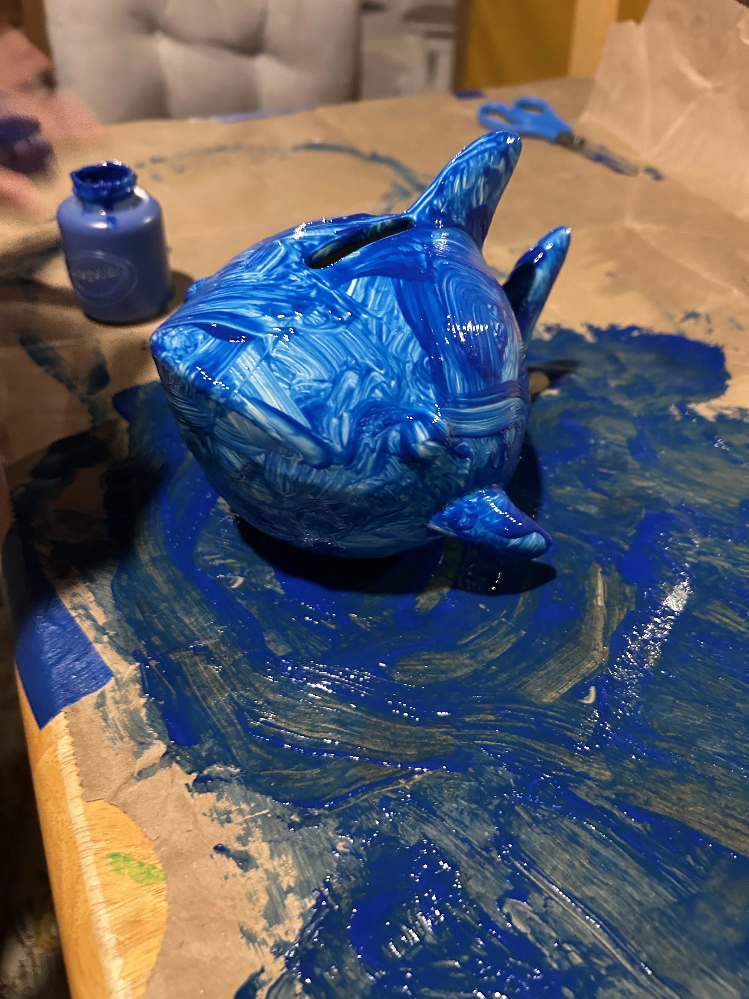
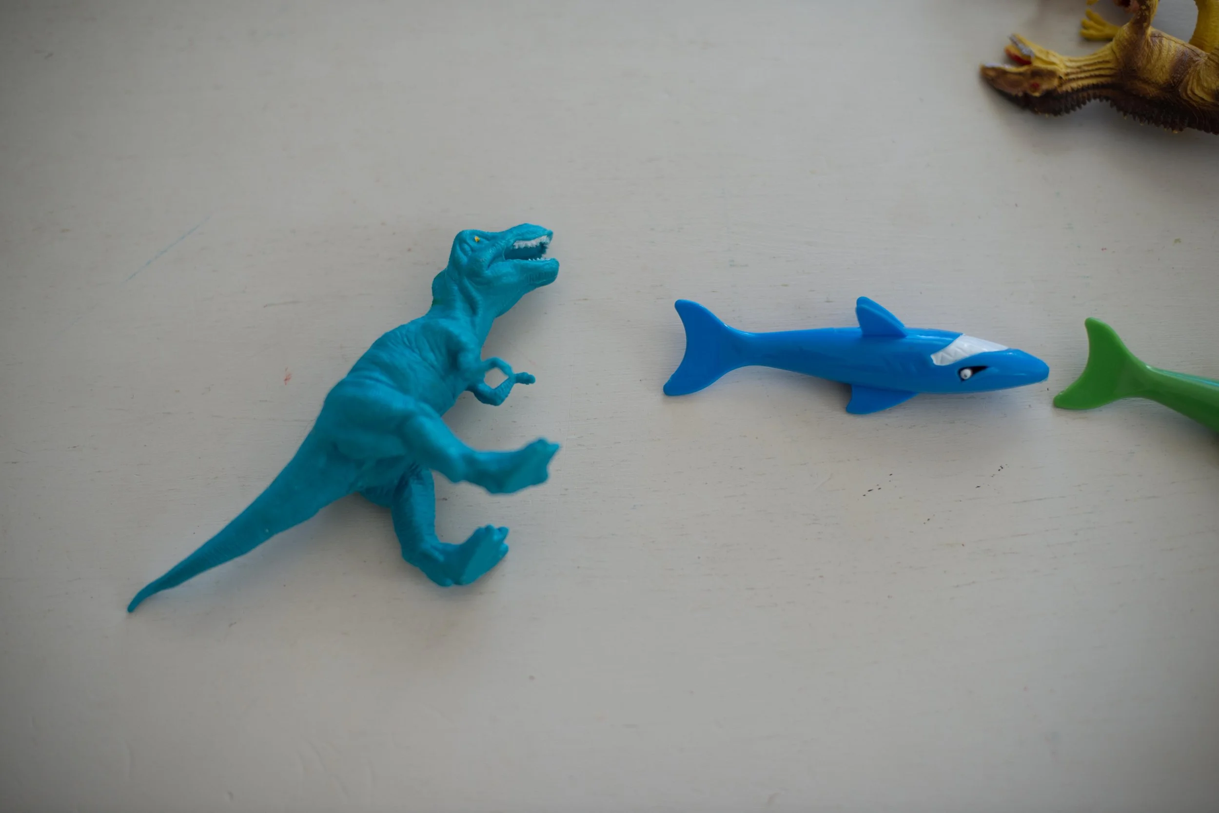
So far so blue, I’ve done a pastel drawing, did some documentary style photography of blue things around my house, and started a blue canvas with gouache and copper leafing. Each color I do a pastel, marker, or watercolor “drawing” and at the end of the year I’ll put them all together for a rainbow collection. They are quick little moments at the beginning of each color, almost like an introduction to the color. Hi, how are you? Oh, and don’t forget the blue shark bank project. That was mainly my son’s project, but hey, it’s blue.
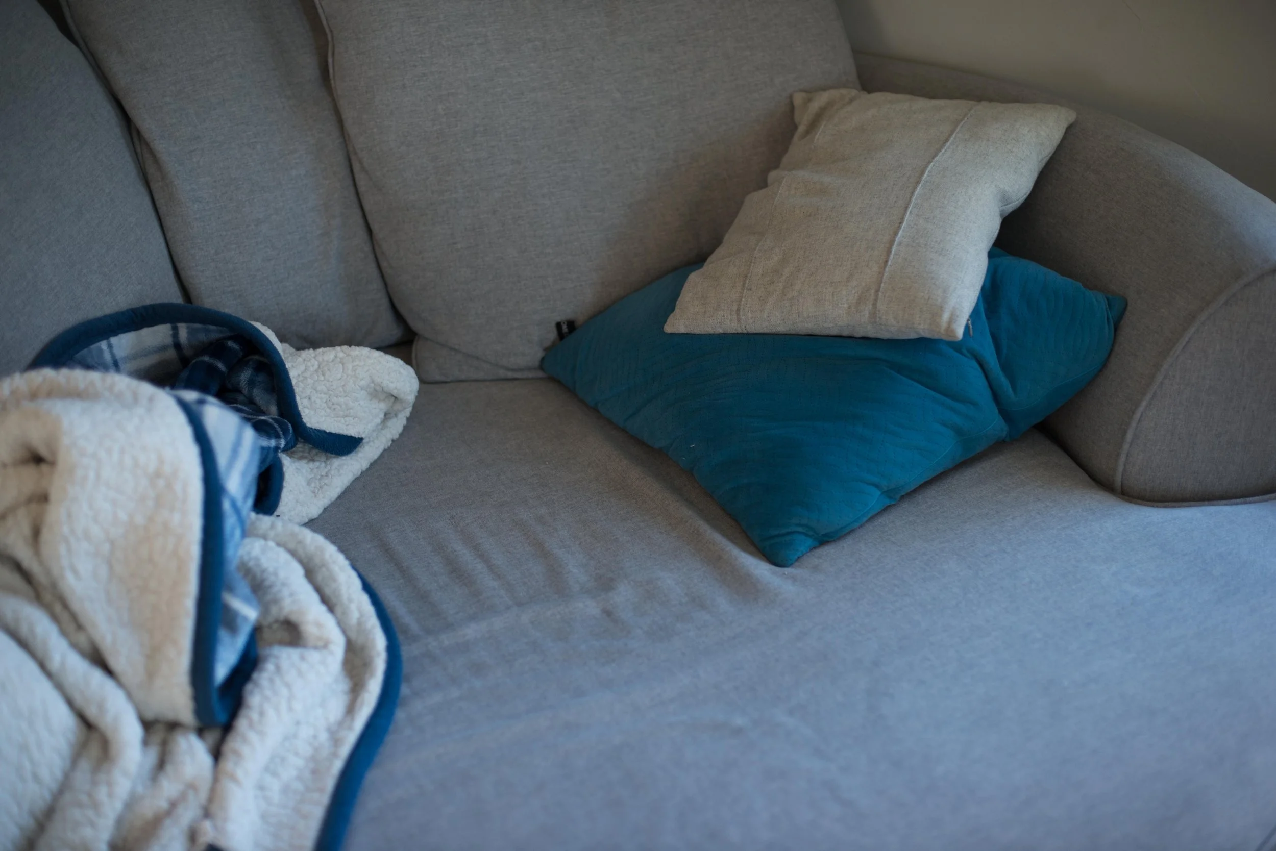
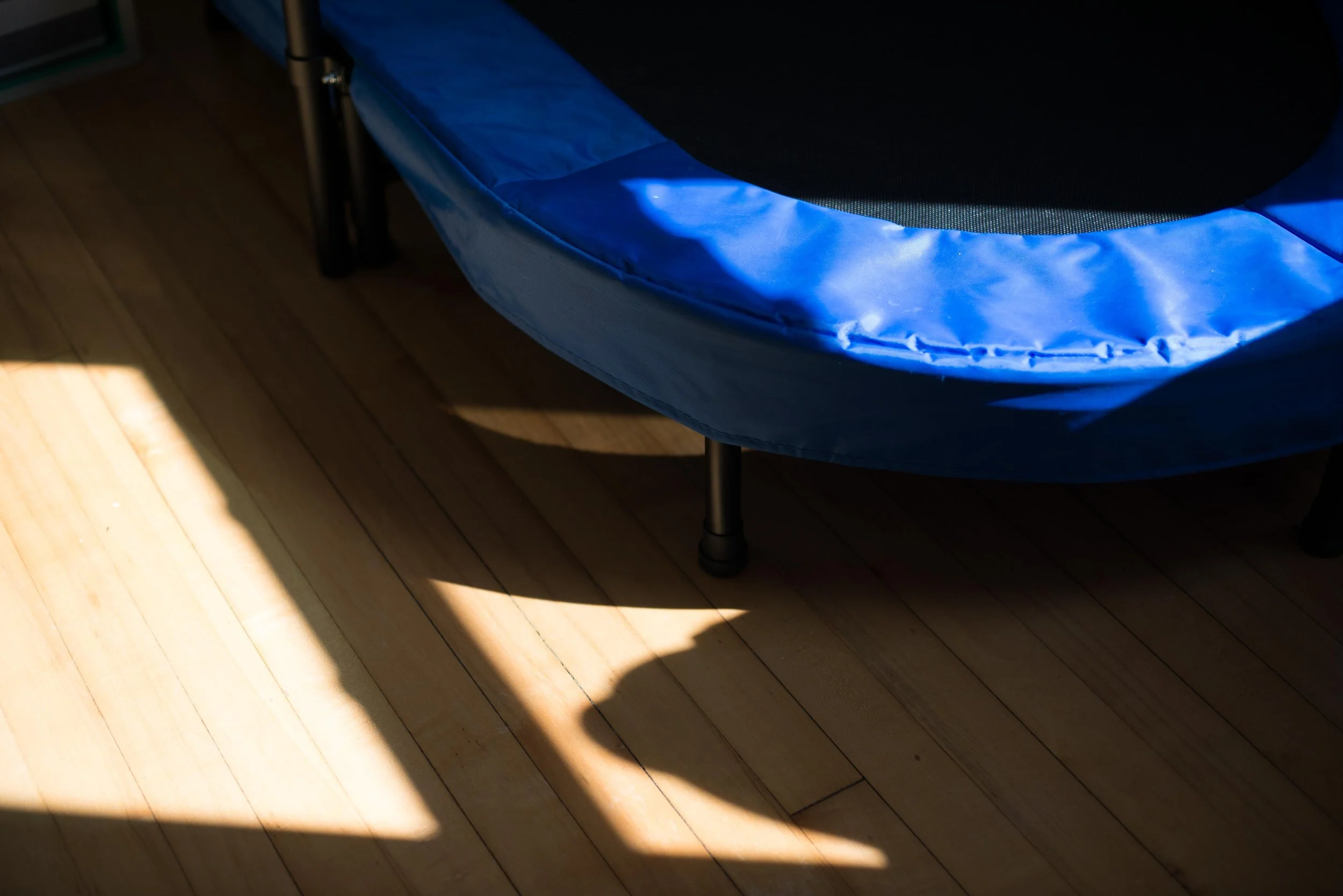
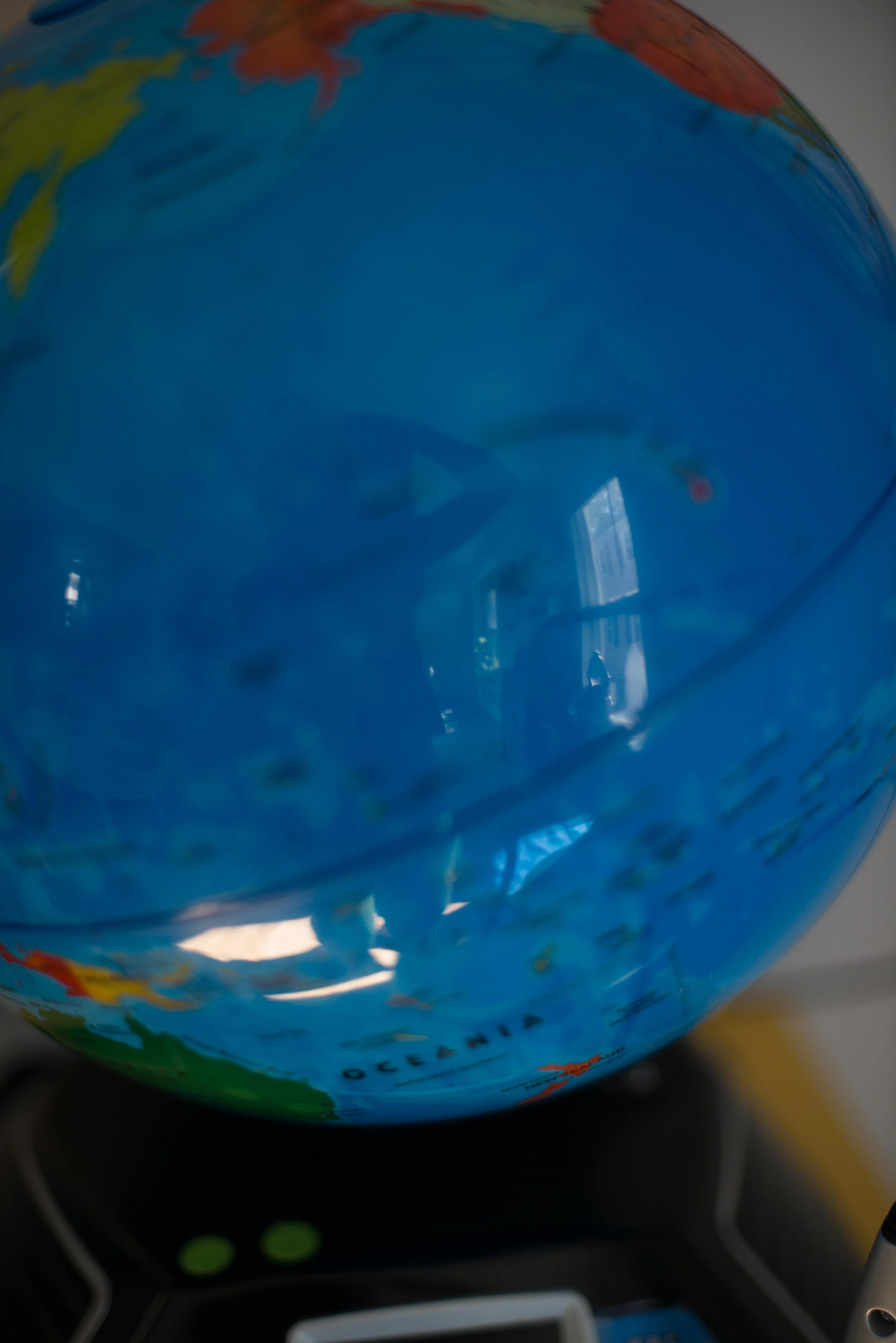
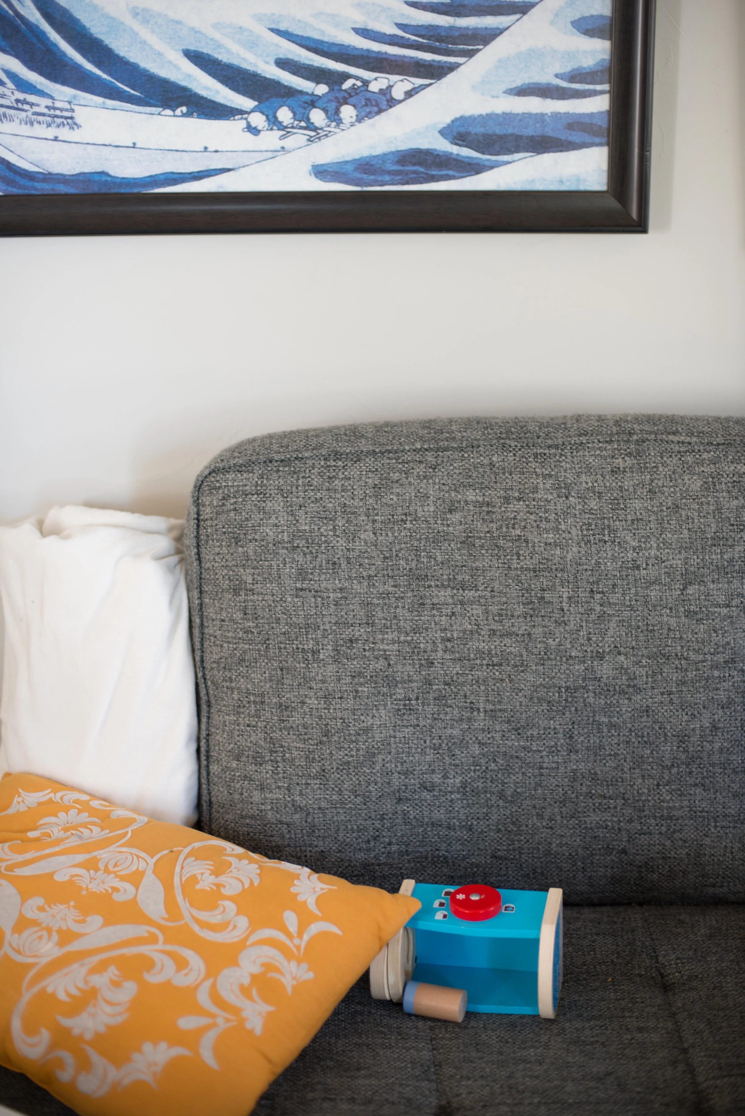
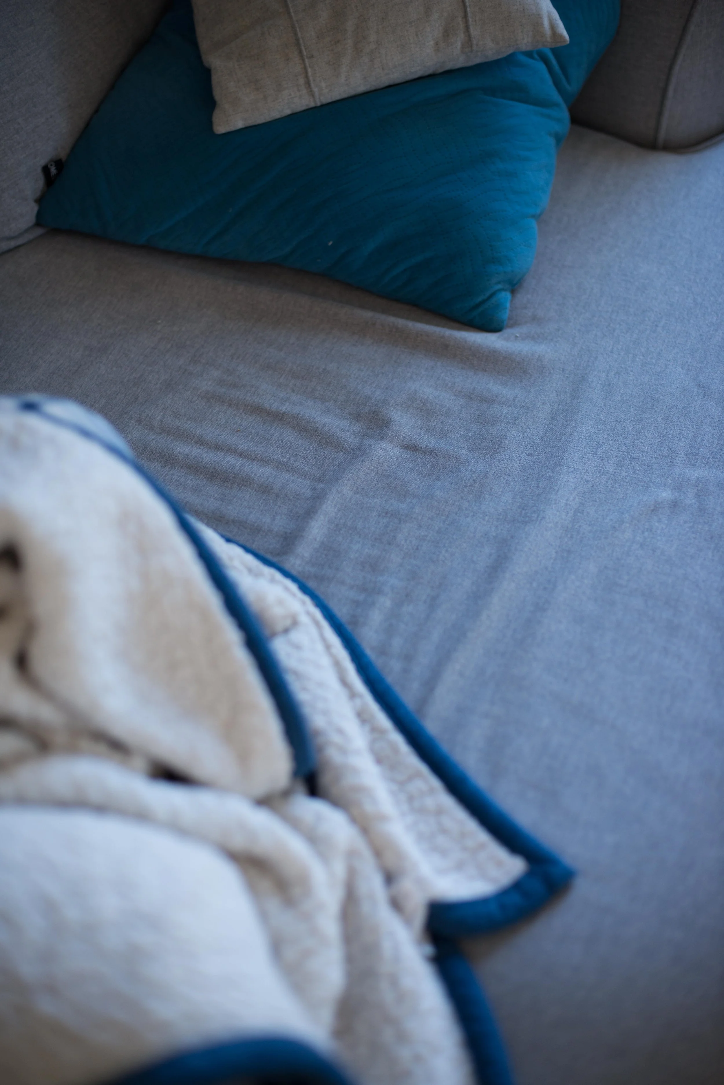
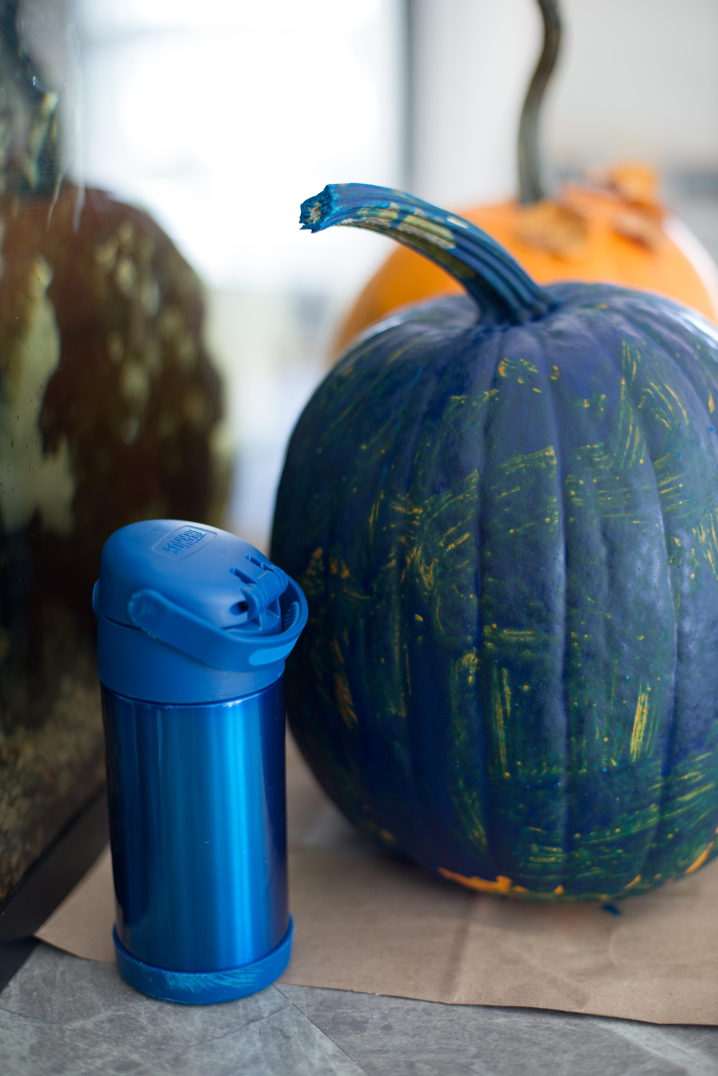
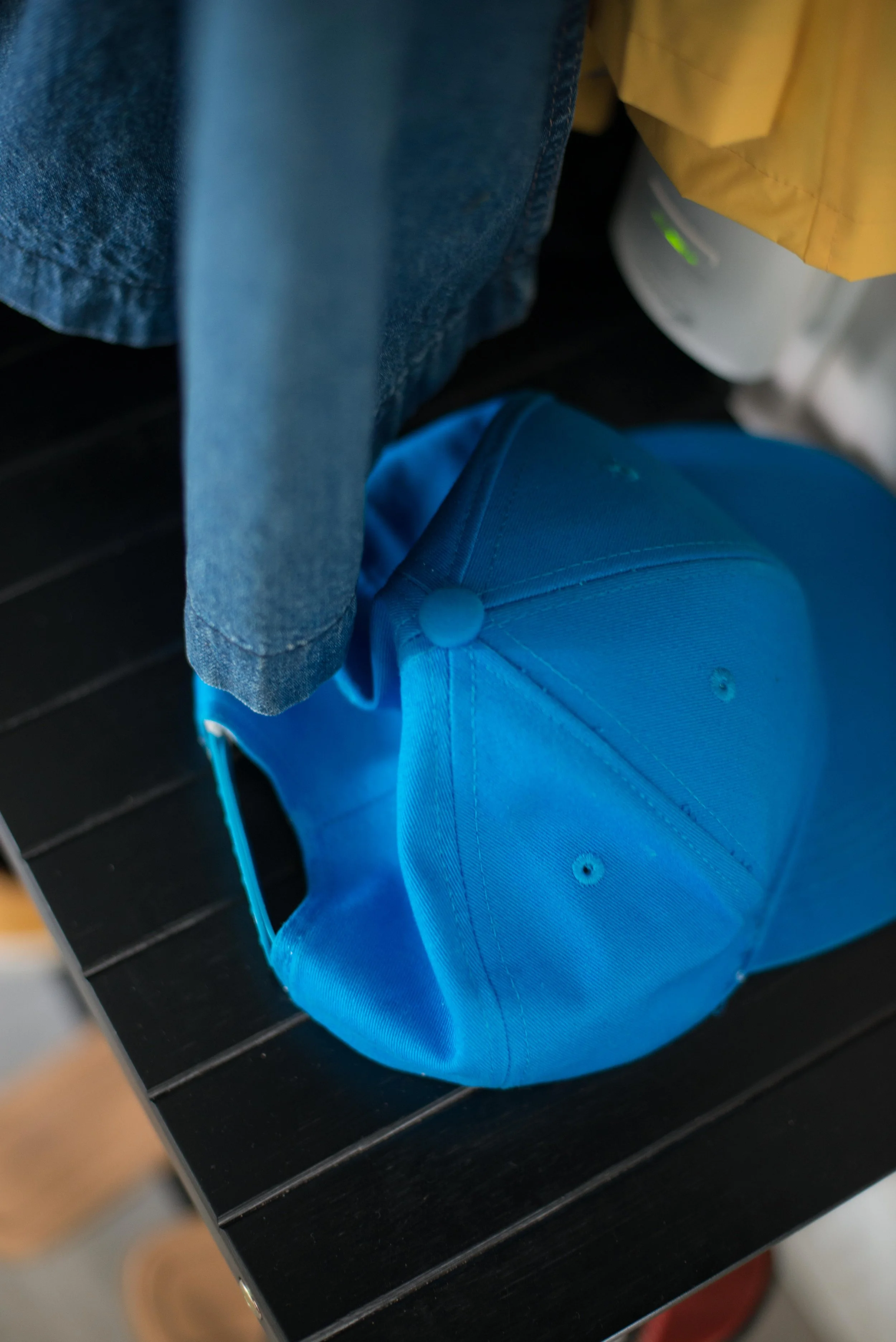
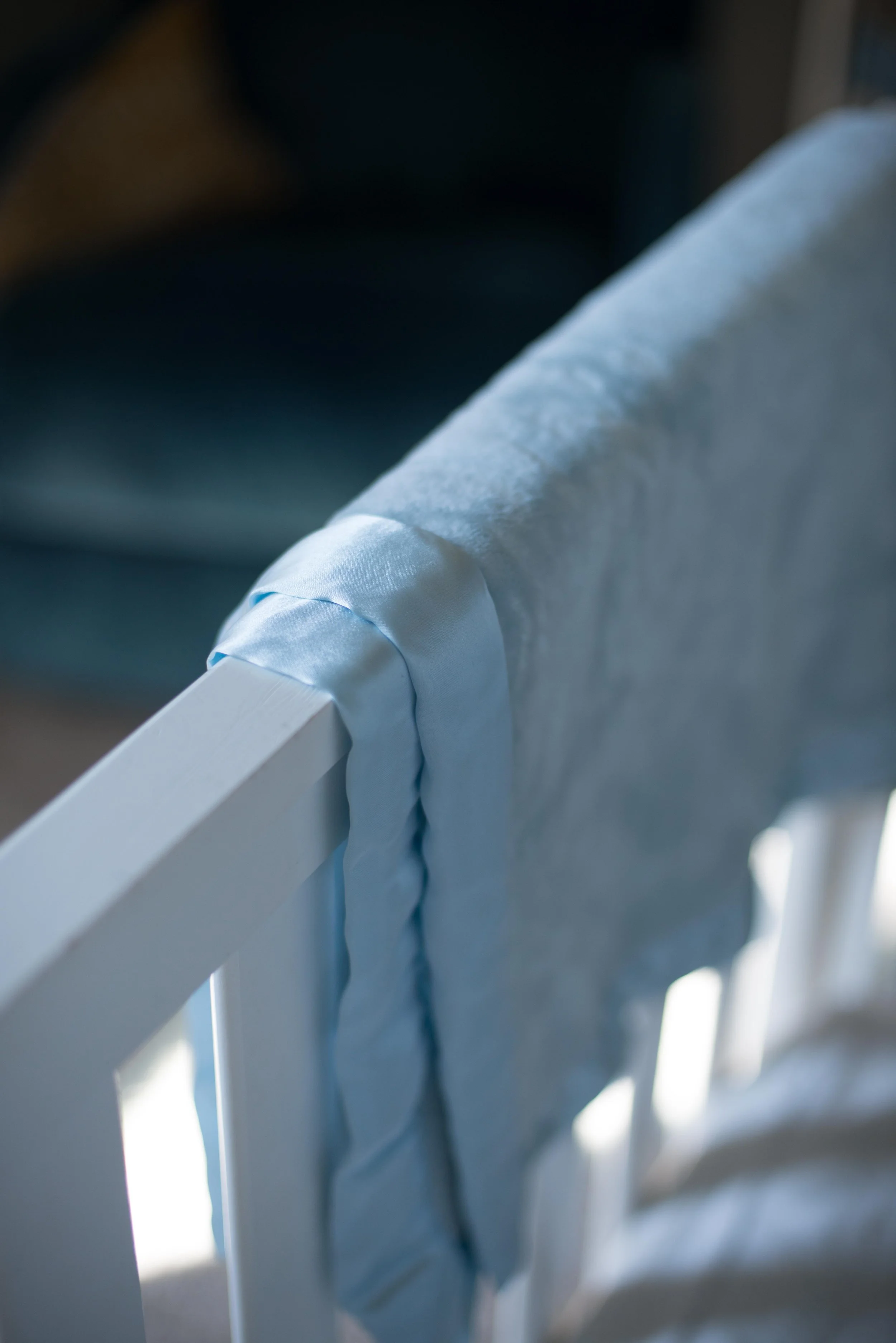
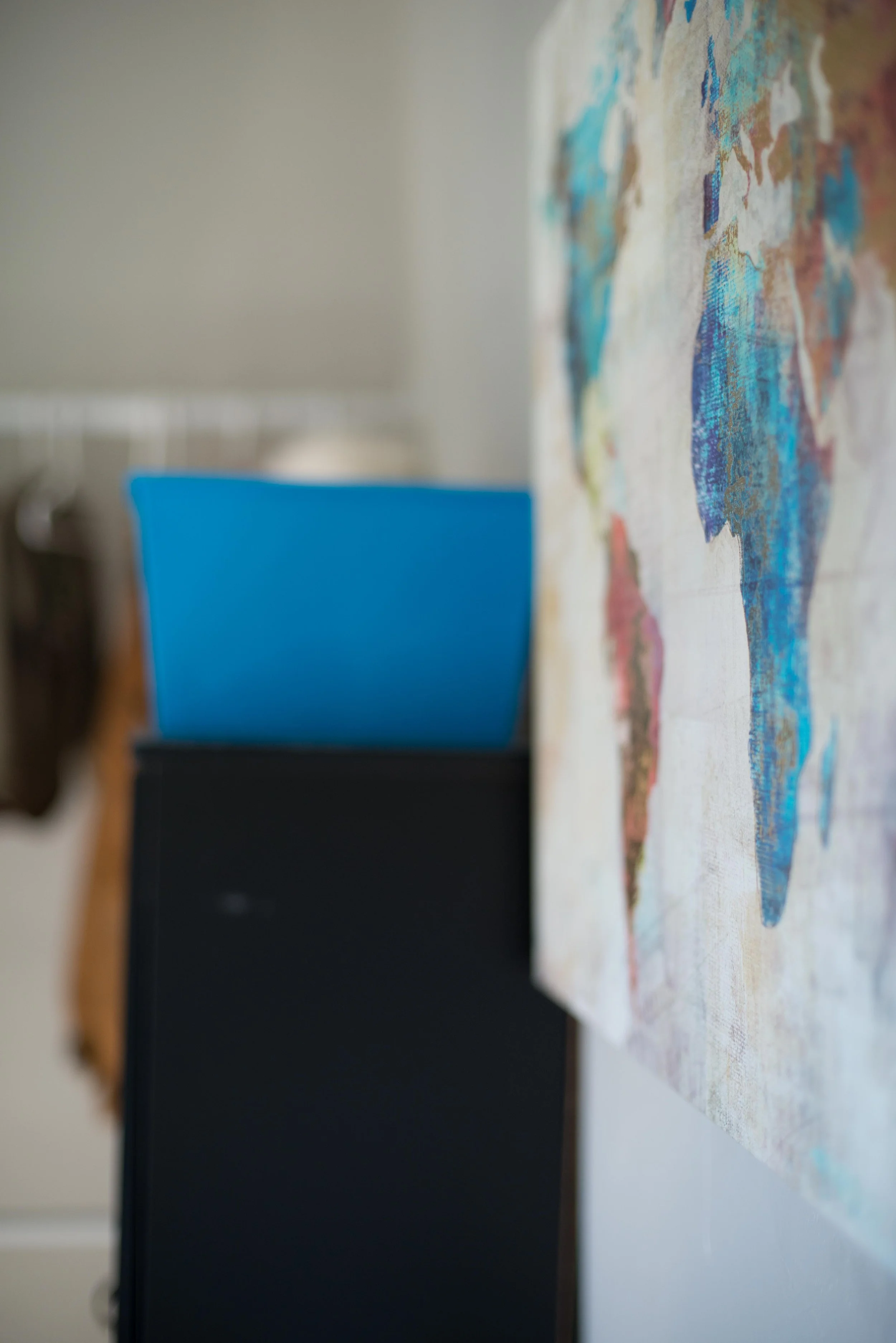
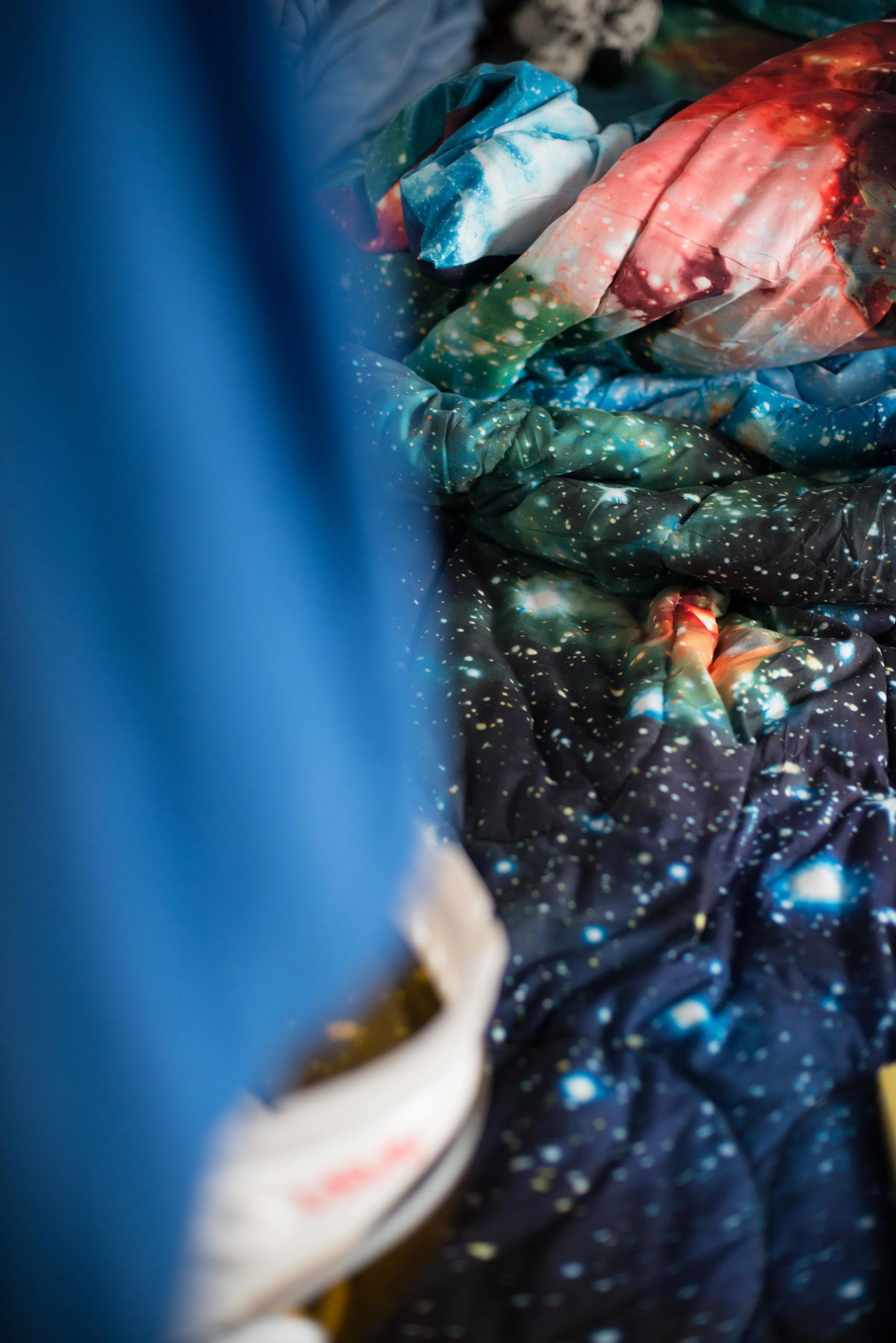
These are images of blue items that I found, as I found them, around my house. I was surprised to find this many items, because I don’t think of blue as a color that fills my home. There was more than I would have guessed.
This collection of images reminded me of a photo project I did in the past where I took photos of different rooms and surfaces in four different houses and lined them all up next to each other. It was one big print. It was interesting to see the different personalities belonging to the different houses. I thought it curious how each homeowner gave different rooms more decoration than the others, or how similar some of the rooms were put together. The space of home has always been a passion project for me. Maybe I’ll pick up that project again in the future. More homes to document.
I titled this canvas “Sweet Dreams”. It was a gift. I wanted to do something I’ve never done before, and I ended up doing many things I have never done before. First, I decided to only use a painting knife to apply the gouache. Second, I prayed that this image I was about to make would positively affect the recipient’s sleep. That was out of my comfort zone, but hey, if it actually happens, how amazing would that be. God cares about the little things, even sleep: “for he gives to his beloved sleep.” Psalm 127:2
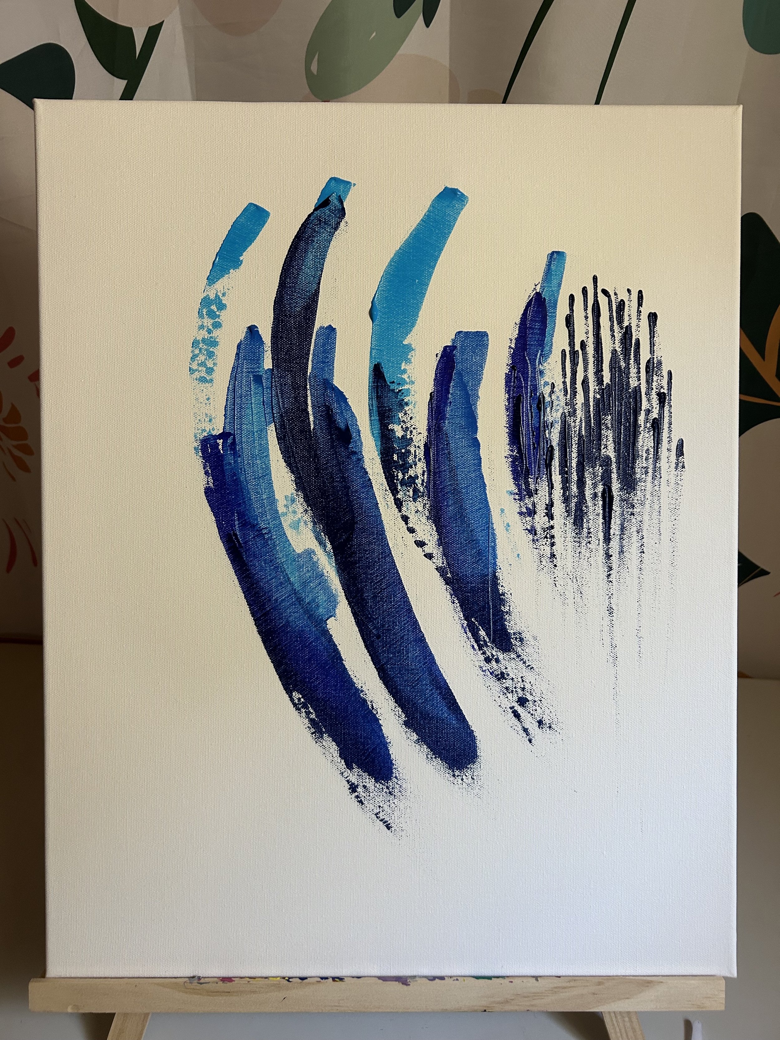
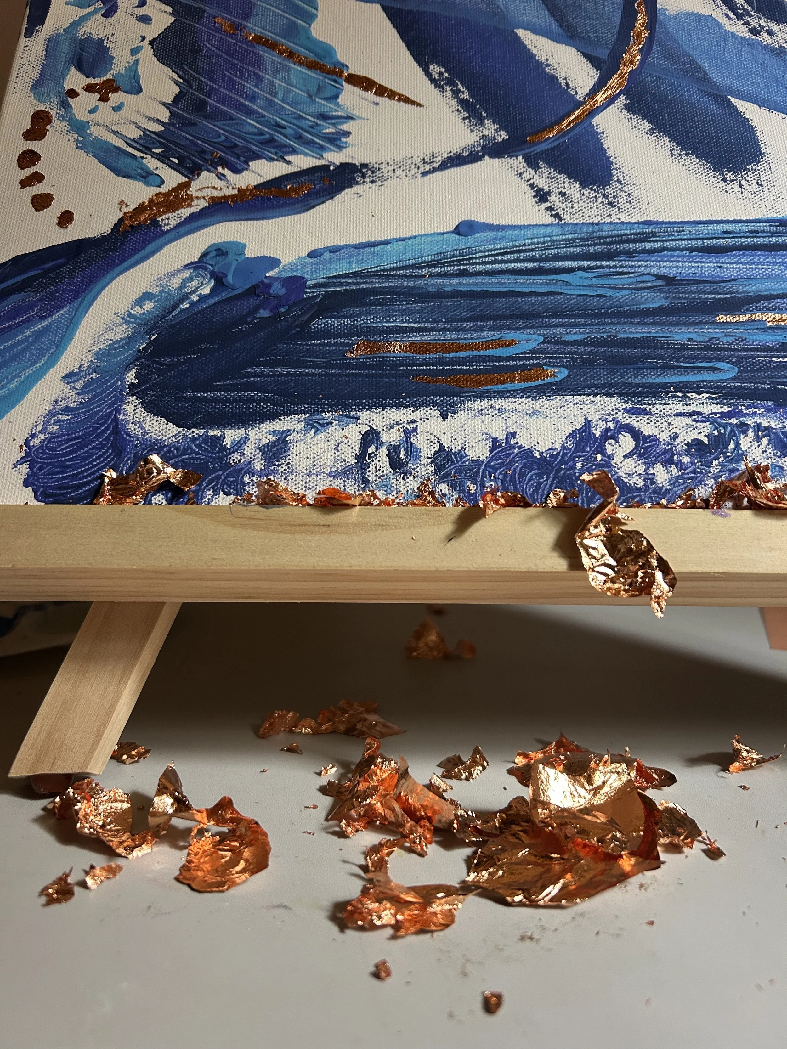
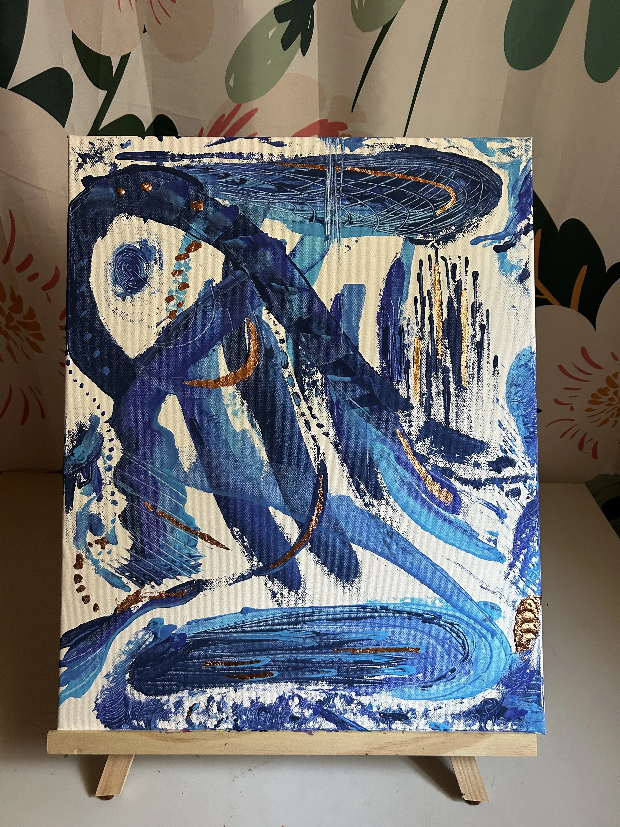
Third, I decided to accent all the blues with some copper leafing. In the past, I have attached leafing to a canvas via the paint on the canvas. This time I experimented with two different glues. One was Ultrabond, simply because it was what I had on hand from the bouquet project. The other was hot glue. That was inspired from an Instagram video. Fourth, no there’s no fourth. That’s it.
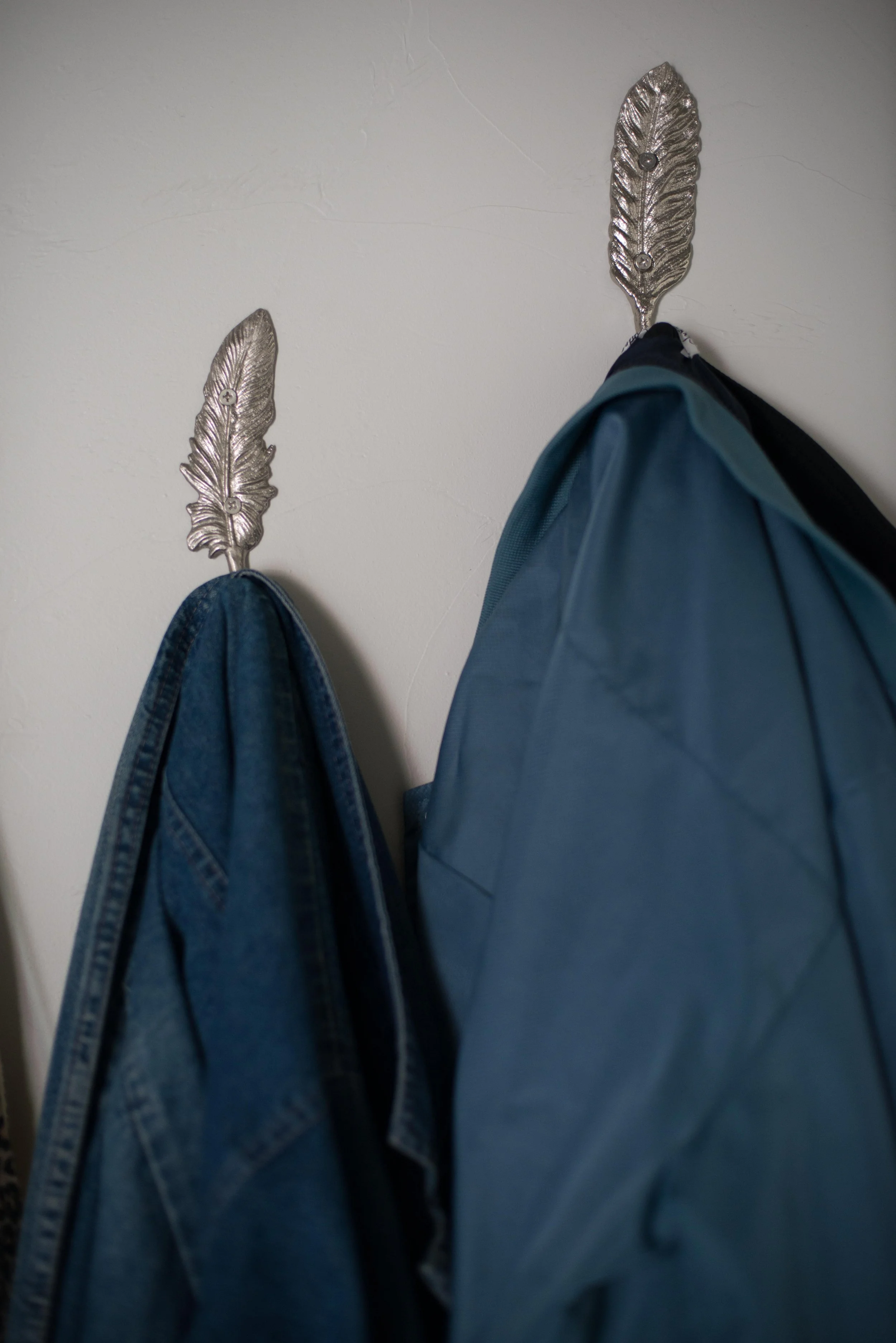
I have found myself wearing more blue. On purpose, but more like giving into the color because it is my current color. Normally, I like to mix and not match when it comes to colors, patterns, and textures with my style. But during my blue color I have just let all the blues find their place on me at the same time. Not quite monocolor, but almost. It’s fine. I find it a little boring. But I also am finding new outfits within my closet, so that’s rewarding. I also find myself in many complementary surroundings at this time of year. So much orange everywhere. Happy Fall.